My name’s Nathan Duncan, and I’m a Communication Designer. I understand that design doesn’t start with sketches but research. I analyse briefs and put in the work to know what the client or audience needs to be best satisfied. I’ve applied my skills to typography, layout design, print design, video production and editing, motion graphics and packaging.
I employ a deep knowledge of design thinking and a thorough creative process to create designs that have people at the heart of them. Most importantly, I’m incredibly passionate about design, and I can’t wait to put my skills to work while I continue to grow and learn.
Learn more from the biography video I’ve produced for INTRO 2020.
Stori
Stori was a collaborative project with Felicia Lawrence and Tyfanny Tiarasaty, in which we were tasked with creating a product or service that assisted young people (18-25) while travelling. We conducted surveys with people who fell into this age range, using feedback to develop Stori.
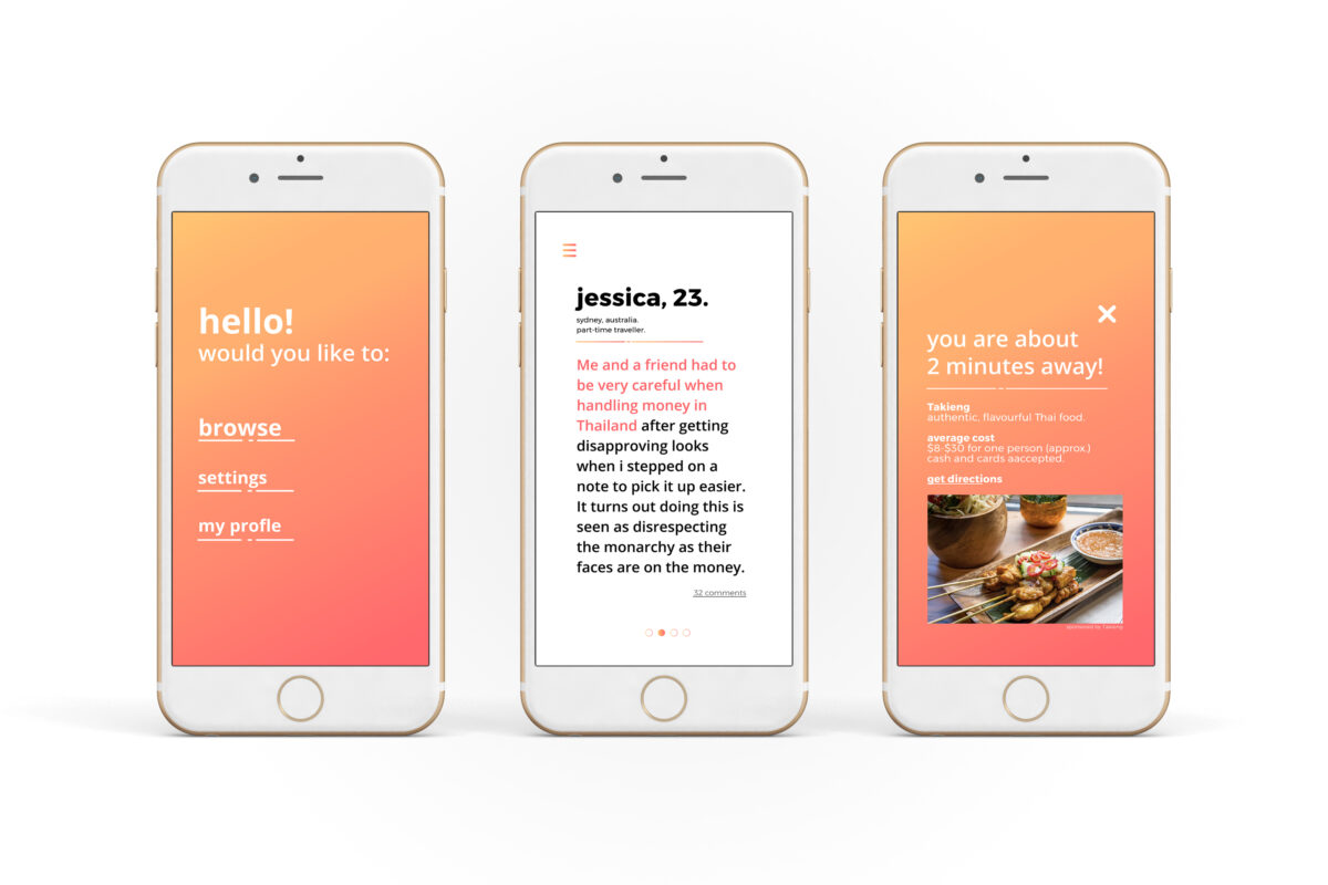
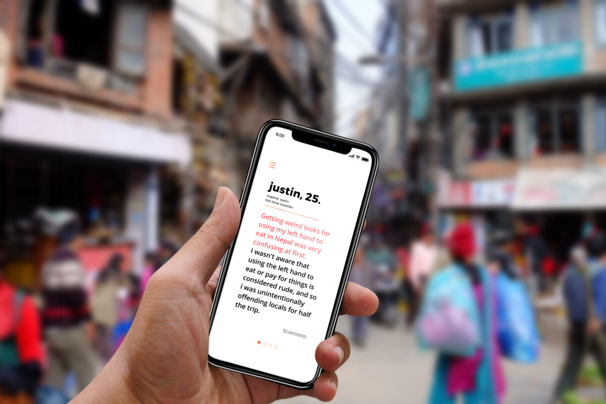
Stori is a mobile app where you can view users’ Storis based on your real-time location. Storis are fun, entertaining anecdotes that also inform the reader about a small cultural difference or faux pas, allowing them to navigate the small interactions we often forget to plan for much more easily.
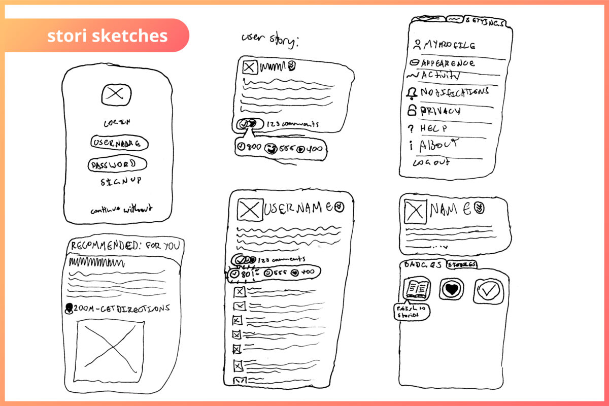
I was responsible for the core idea of Stori, as well as the monetisation plan, something that was required for this project. I also created the structure of the app, as well as the stylistic direction and rollout plan. However, Stori was a highly collaborative project, one that wouldn’t have been as well informed and well executed without Felicia and Tyfanny’s contributions.
Stori was so fun and fulfilling to work on as we got to directly interact with the audience for some effective design thinking. Beyond this, I got to work collaboratively while creating a beautiful style and unique brand.
Barnardos Australia Campaign
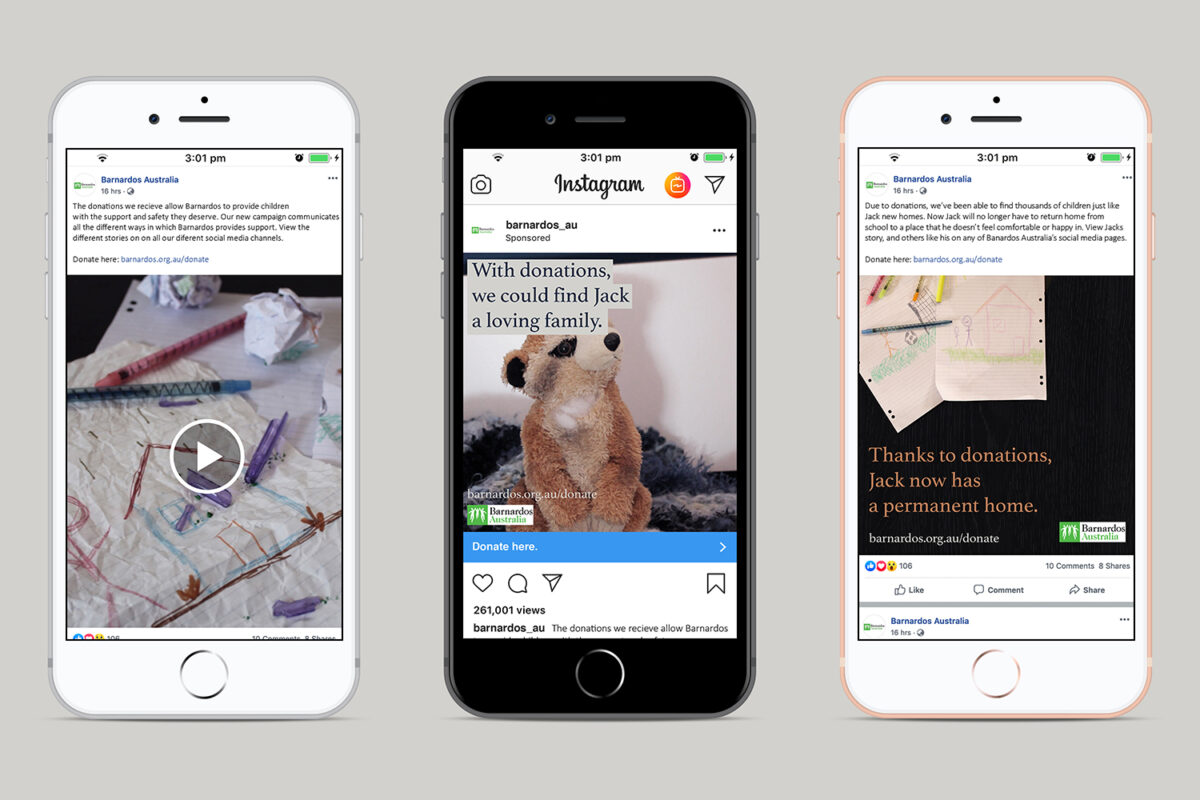
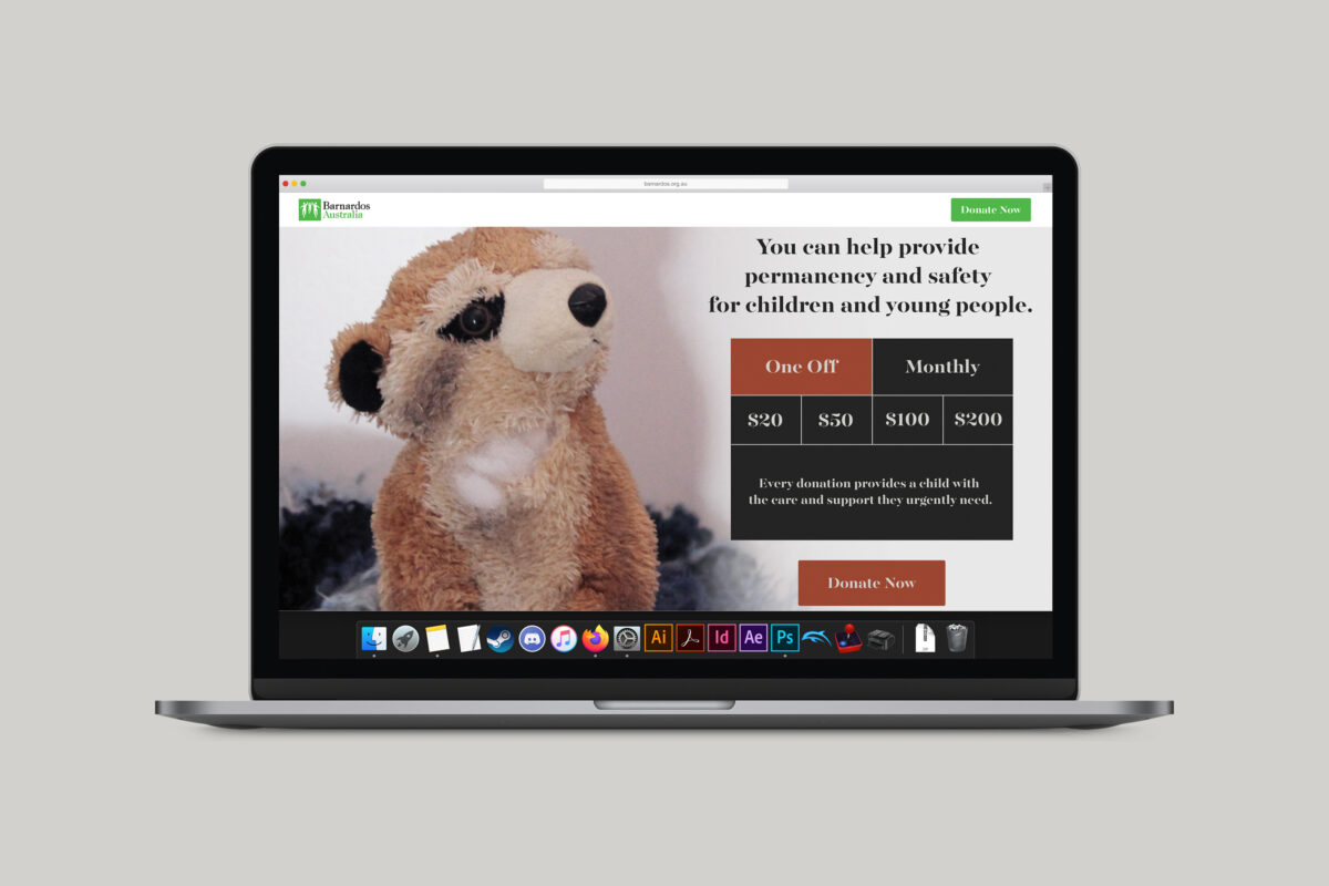
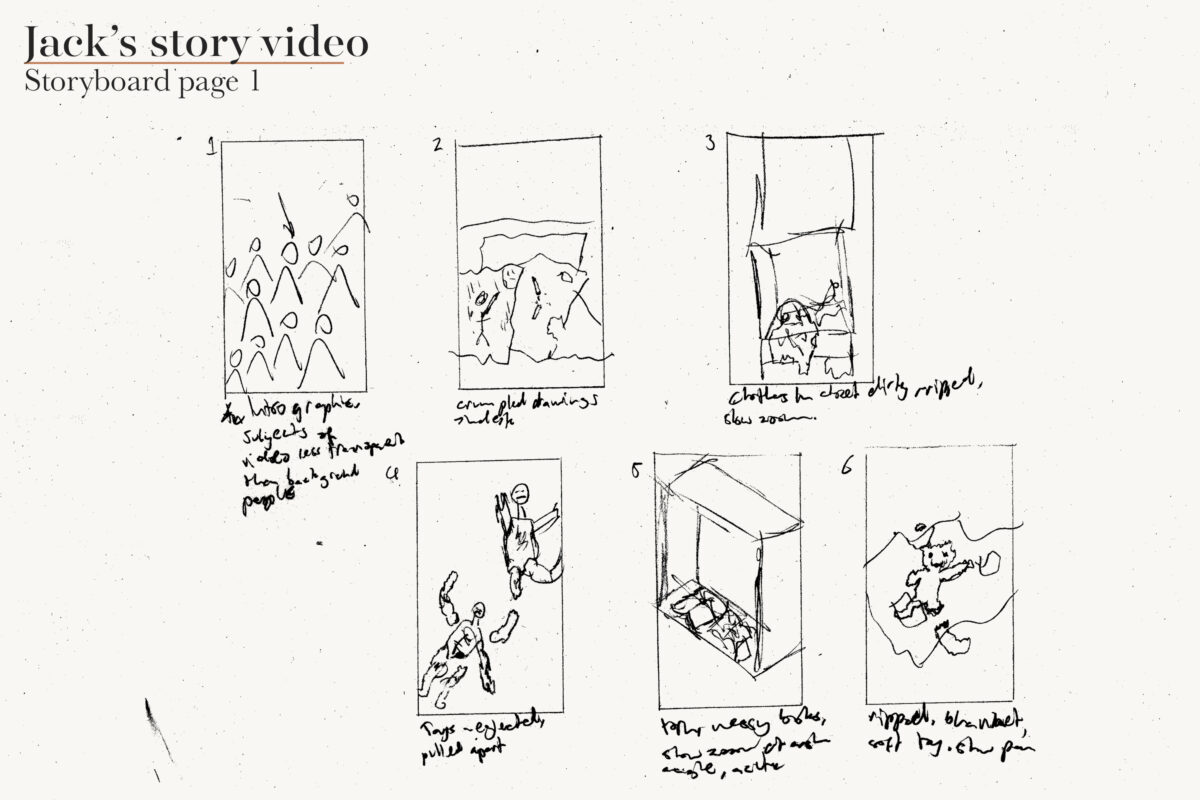
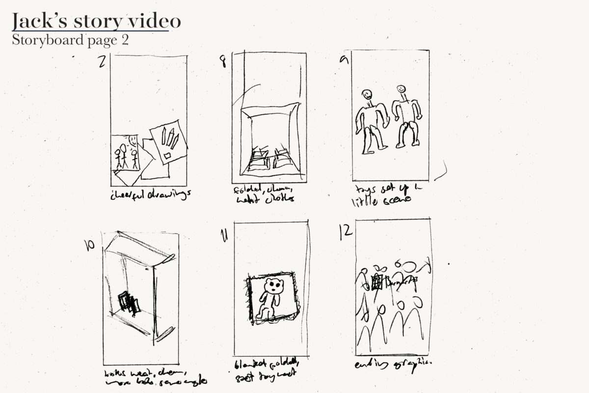
We were tasked by the marketing and design team of Barnardos Australia to create a campaign that would attract a younger audience. I found that most young adults didn’t know what Barnardos Australia did, so I looked to inform this younger audience while encouraging them to donate. My idea was based on short narrative videos tailor made for social media, along with some additional collateral. Throughout the process I implemented feedback I received directly from the Design and Marketing team. When I presented my campaign to the Barnardos Australia Design and Marketing team, it was met with very positive reception.
The video follows a distinct, deliberate style, one that focuses on comfortable colours and textures. This style allowed me to visualise this story without being graphic or confrontational, making the videos more accessible, so that the viewer ultimately leaves more open to aiding Barnardos Australia with a donation.
This project demonstrates my desire to use design to contribute to important causes or organisations. Beyond this, it demonstrates design thinking, branding and content execution across a number of formats.
If you want any more details, please don’t hesitate to contact me and ask. I’d love the opportunity to discuss my work!
