I'm a Graphic Designer & Photographer with a vivid interest in Design, Art, Business, Nature & Spirituality. I enjoy a broad spectrum of creativity spending most of my time designing branding, pen sketching, photography & videography. On the weekends, you'll find me out in nature photographing seasides or reading a book about the nature of life. I'm inspired to learn about design wholly and not just humanly, always fascinated about natures engineering.
Ma Sake
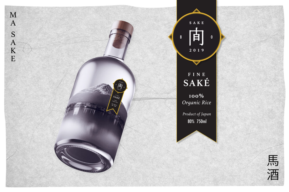
Ma Sake, a 200 year old Sake producer in Japan, prides themselves on being one of the best for premium rice wine. Having newly exported into the Australian market, Ma Sake seeks to market their product towards sake loving Australians for the upcoming Japanese new year. Following Japanese tradition of giving gifts at this time, the bottle is designed to be bought and given to a loved one on New Years Eve. The 1L bottle, costing $99, places itself within the premium range of alcohols available.
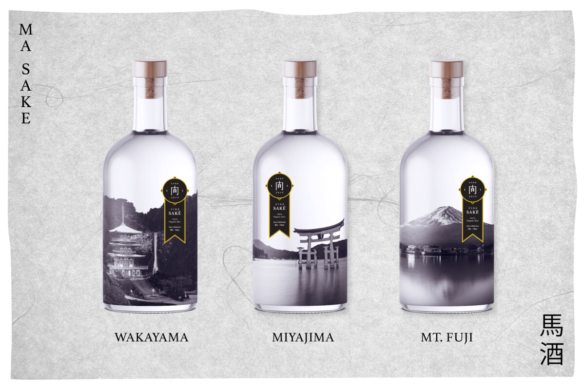
The three pillars of the design are authentic Japanese culture, celebration and exclusiveness. The black & gold refer to the transition of night to day on the new year. The iconic Mt Fuji around the packaging with black & white imagery on the bottles immerses the observer into Japan's iconic scenes. Letterforms from Japan and the all caps serif lettering are announcing a sign of importance/exclusivity which is often found in branding. Inspired by the product's high price point, I utilised a ribbon style layout for the labels, a style synonymous with award-winning alcohols.
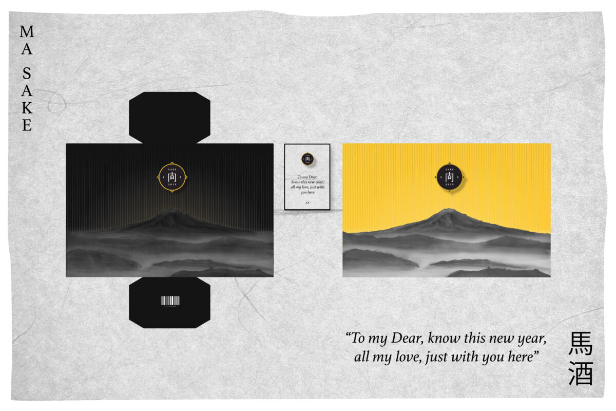
Unboxing the gift is interactive with a few steps involved. First, the outer sleeve is slipped off the inner box. Two doors then open at the front, where a letter is placed for the recipient. Then finally the bottle... A clear glass bottle with one of three Japanese scenes stuck on the rear. The sake and its packaging gifting an immersive glimpse into Japan from Australia.

Centennial Parklands
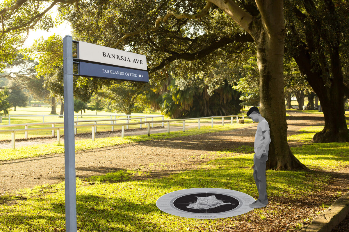
Tucked away amongst the bustling city of Sydney, in the high socioeconomic area, the Eastern suburbs, lies a fun & peaceful park. The park has many visitors yearly, who enjoy the array of sports fields, leisure activities, cafes, children's play areas or maybe the beautiful natural land with forests & open sunny grasslands. The design intention is to heighten the difference between the city and parklands, giving the visitors a more rewarding escape from the "hustle n' bustle".
I sought to mirror nature's designs through the gentle use of monotone shades and simple yet functional interactivity. The prestigious ideal of early British culture lies within the typography choice, echoing earlier developments in English letterforms and handwritten words. Icons are created from traced photographs to contrast against the mechanical style icons throughout the city. For the centrepiece, I designed a 2.5m wide floor-based map. The map showcases with great proportions the whole park & surrounding suburbs. The circular design is inspired by timepieces including the divisions on the map like the hours of the day. Materiality, it is composed of a high resolution sticker image stuck beneath thick glass for durability. This sits recessed into a slab of concrete. Sitting neatly and unobtrusively, the map collects all design aspects, harmonising nature's peace into the British cultural ideal of wealth & sophistication.