Hi there! I am a communications professional who in the past two years has discovered the amazing world of graphic design. In hindsight, my childhood hobby of downloading new fonts should have been a giveaway that I would love graphic design (especially typography!)
I love diving deep into design problems (over a good cappuccino!) and having conversations to create both fun and thoughtful solutions whether it is branding, publication design or for the web. My background in business enables me to put my strategic cap on to help organisations use design to do better for their communities and the people they serve. At the heart of it, what I would love for my career is to put my design and thinking skills to use in creating a better world.
Electric Gardens Music Festival
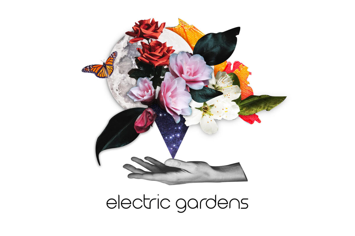
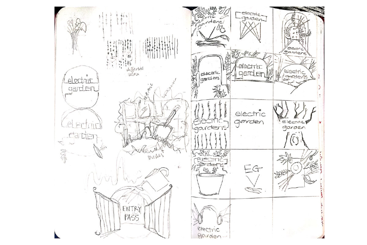
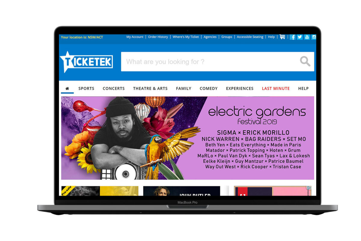
The purpose of this brief was to create a cohesive new brand identity for the Electric Gardens Music Festival with the objective of distinguishing the festival from its competitors. My concept utilises digital collage, which was inspired by the parallels collage in art has to the electronic genre in music - mixing, blending, and re-interpreting existing work to make new compositions and forms. My process sketches show a number of logo thumbnails which explore the fusion of the electronic music and the garden.
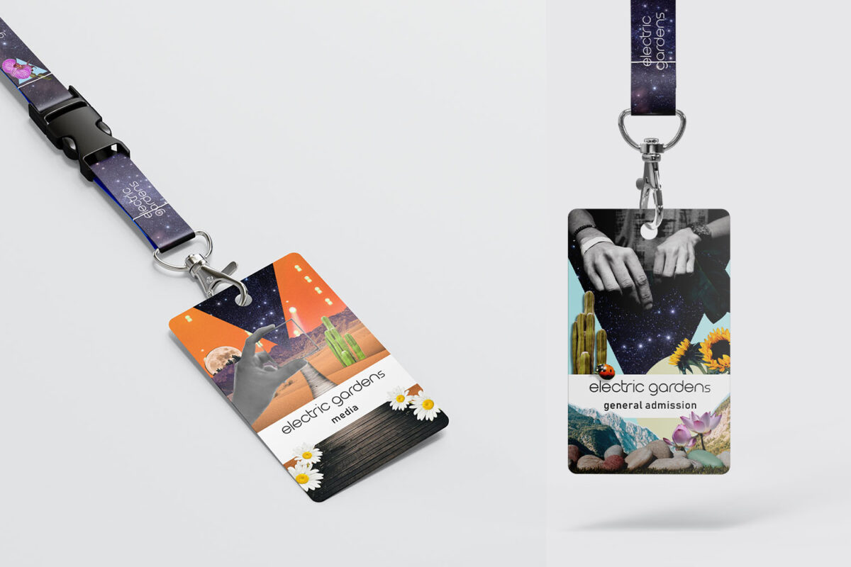
My aim was to create a brand identity that would appeal to the young target audience - modern but blended with the nostalgia associated with music festivals. The collages fuse the electronic and garden theme but there are consistent references to hands (as the skilled tool of DJs) and the galaxy motif which alludes to the open spaces, lights and night-time of the festival. The branding is designed to be flexible and personal, allowing for new themes each year. In designing the collateral, the objective was to make the merchandise appealing and worth keeping, and just as importantly, worth promoting.
AGDA
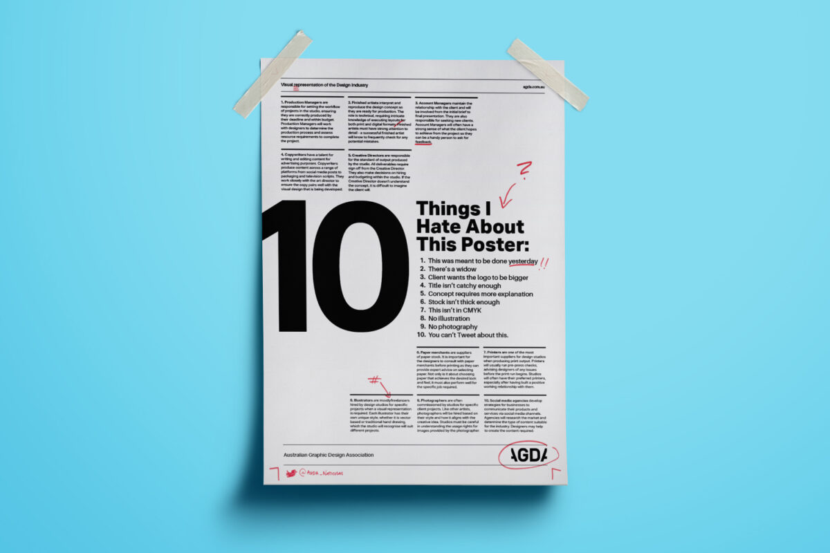
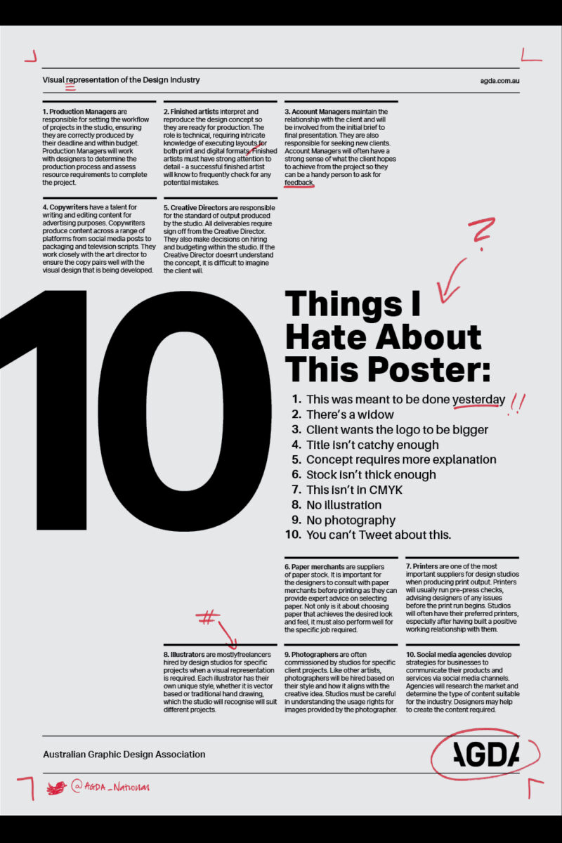
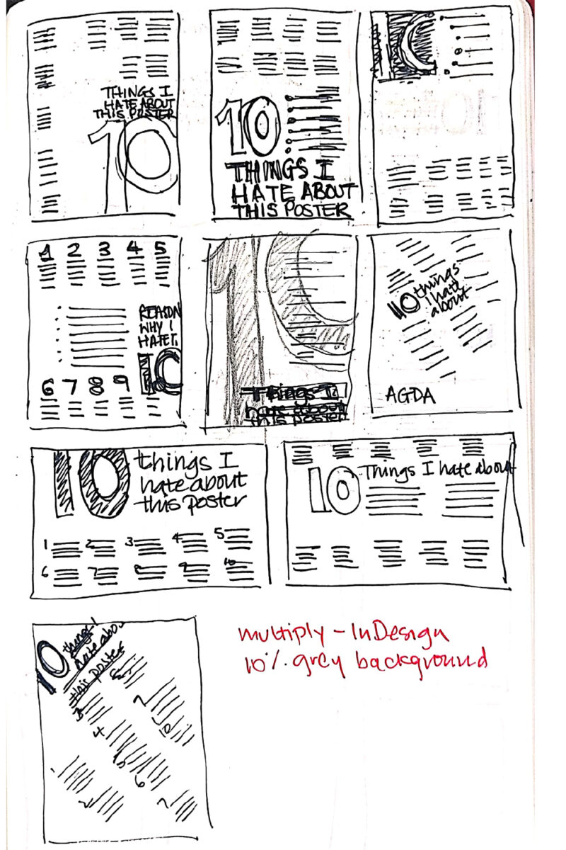
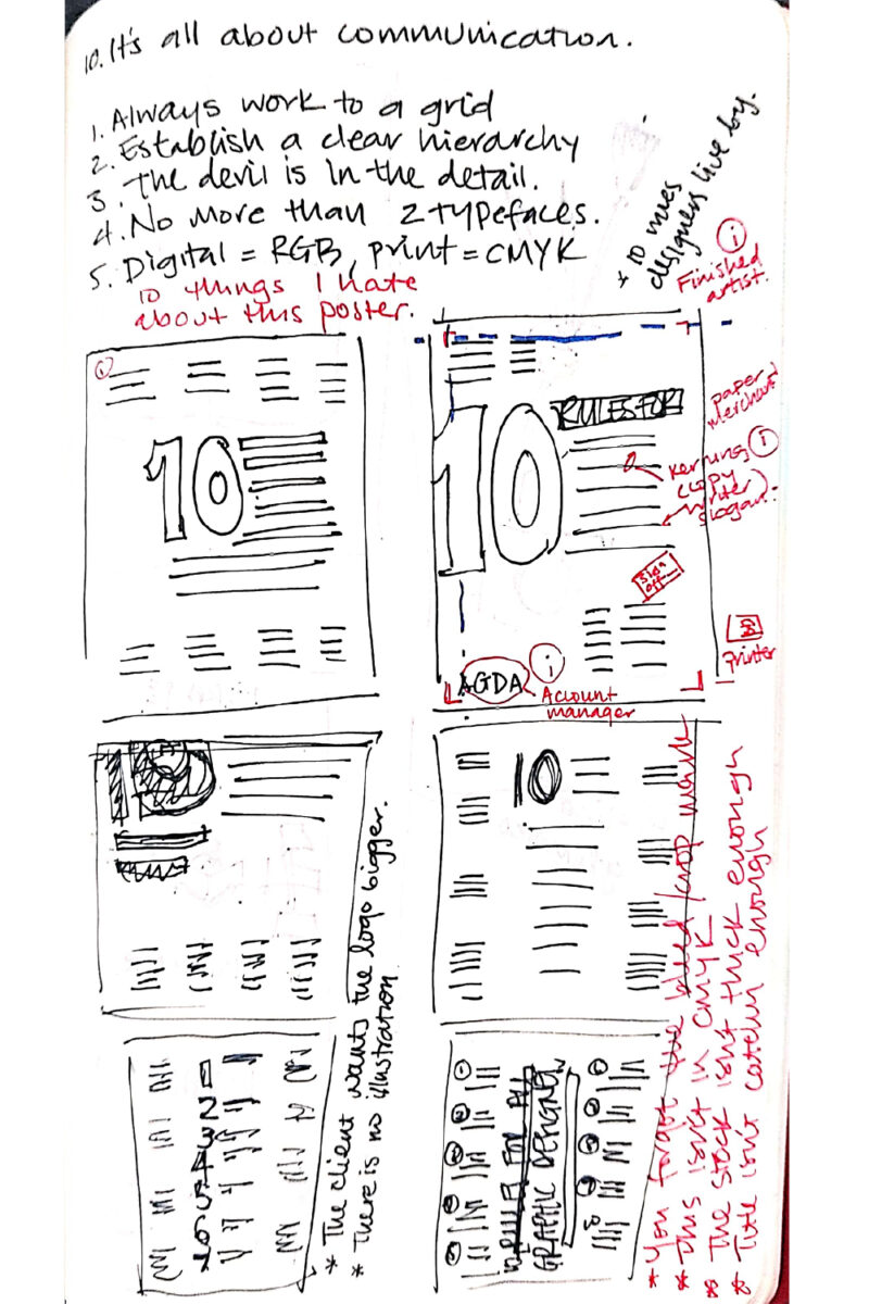
The brief was to design an A3 infographic poster for the Australian Graphic Design Association (AGDA) aimed at design students. The objective of the poster was to communicate the various and different relationships a designer typically has with other key professions in the design industry – both internal and external partners. My process sketches show exploration with poster design layouts sprinkled with common designer pet peeves.
While not a traditional infographic, ’10 Things I Hate About This Poster’ uses each number (and “hate”) to explain each industry role while highlighting a common frustration each role typically faces. This concept utilises the shared understanding graphic design students and professionals have from practising design on a daily basis. The poster draws on our familiarity from both the infamous Swiss style as well as the common act of getting the red pen out to mark up our work. By showing the ‘errors’ on one poster, it also demonstrates the interconnectedness of each role and ultimately how all these roles need to come together to produce a single piece of work.
