I aim to bring form and function together in my designs to create seamless communication and experiences within brands. Fascinated with the world around me, I constantly draw inspiration from everything I do and see.
My passion for design lies within branding and typography, and most of all design that is clever and functional.
Higher Living Cold Infusion Tea
Brief:
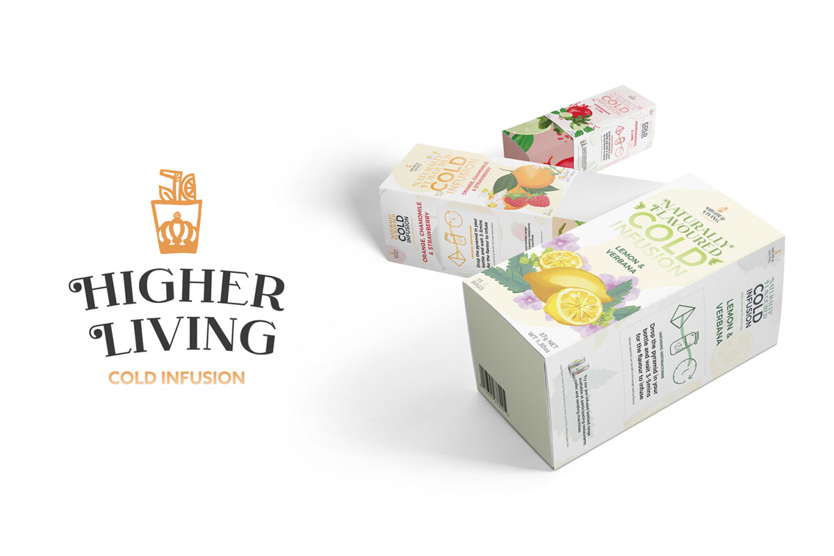
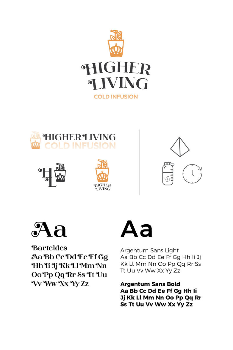
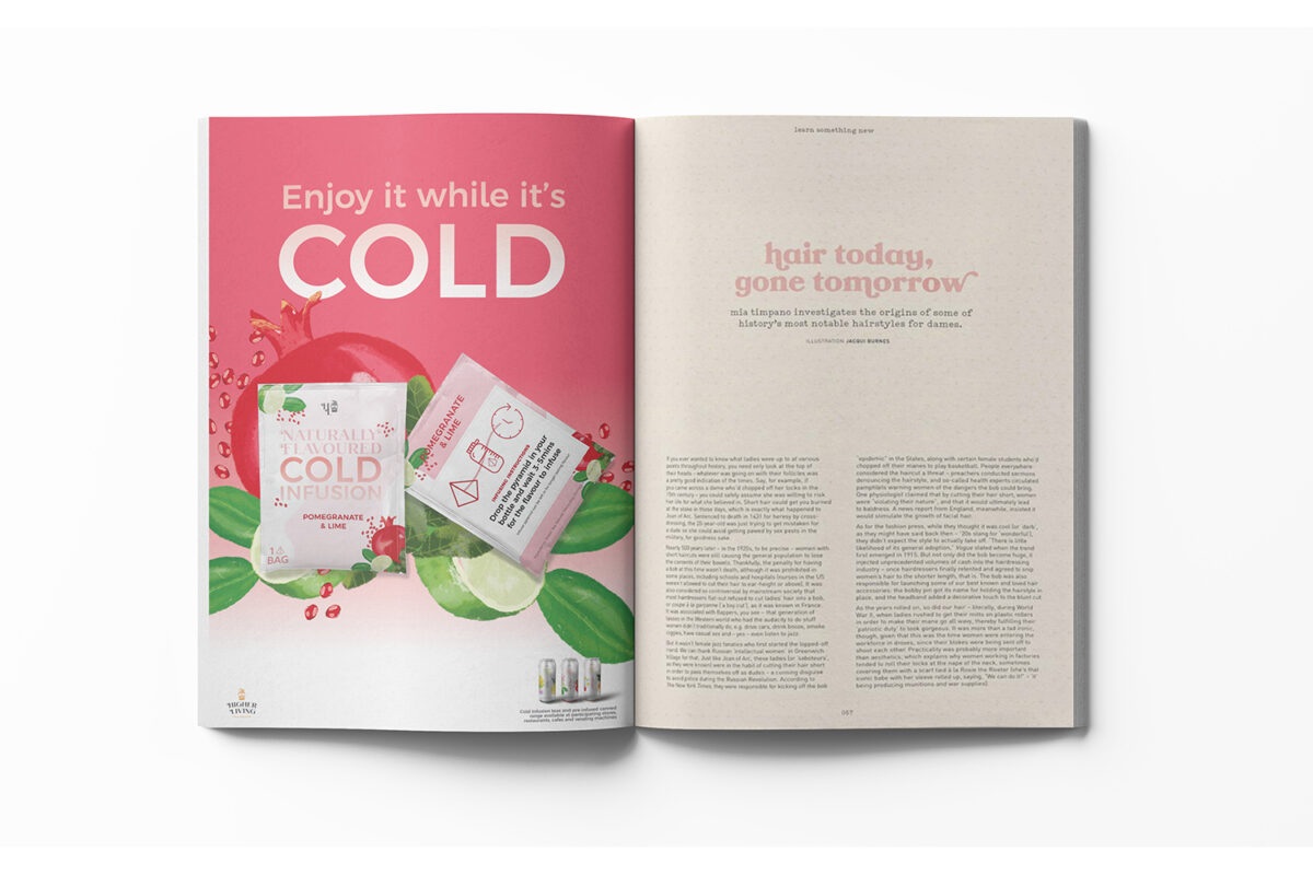
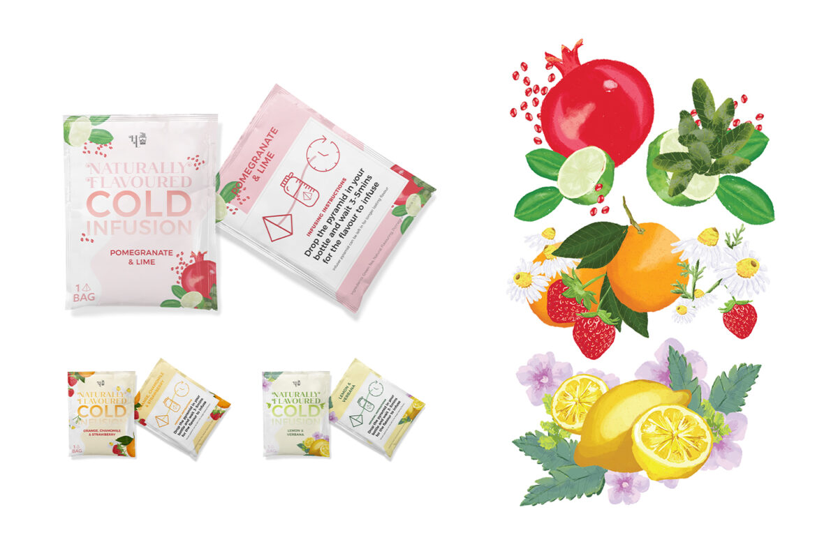
Design brand identity for an upcoming sub-brand Higher Living Cold Infusion Tea. It needs to be bold and fresh, yet familiar to the current branding. Create the packaging for the cold infusion tea bags, as well as designs for the “on-the-go” pre-infused canned drinks.
Rationale:
I approached this brief with bright illustrations of the floral and fresh infused ingredients to catch attention on the shelves. Simple advertising in the right places puts the Higher Living products at the forefront of the consumer’s minds. This way when they are shopping or travelling to and from work they believe they could go for a nice cool iced tea. The bright illustrations against light background of the white packaging allow for the ingredients to stand out and look refreshing.
Ginslinger
Brief:
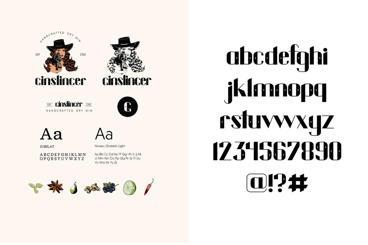
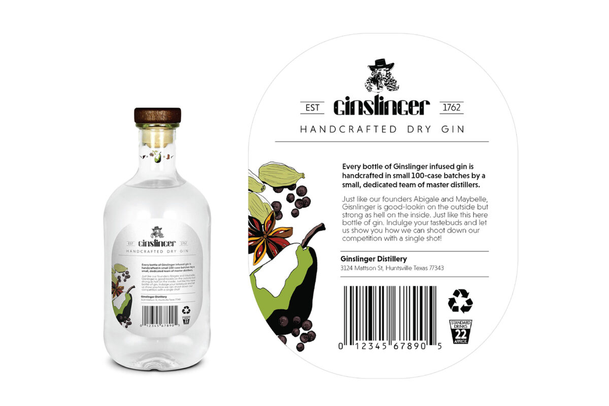
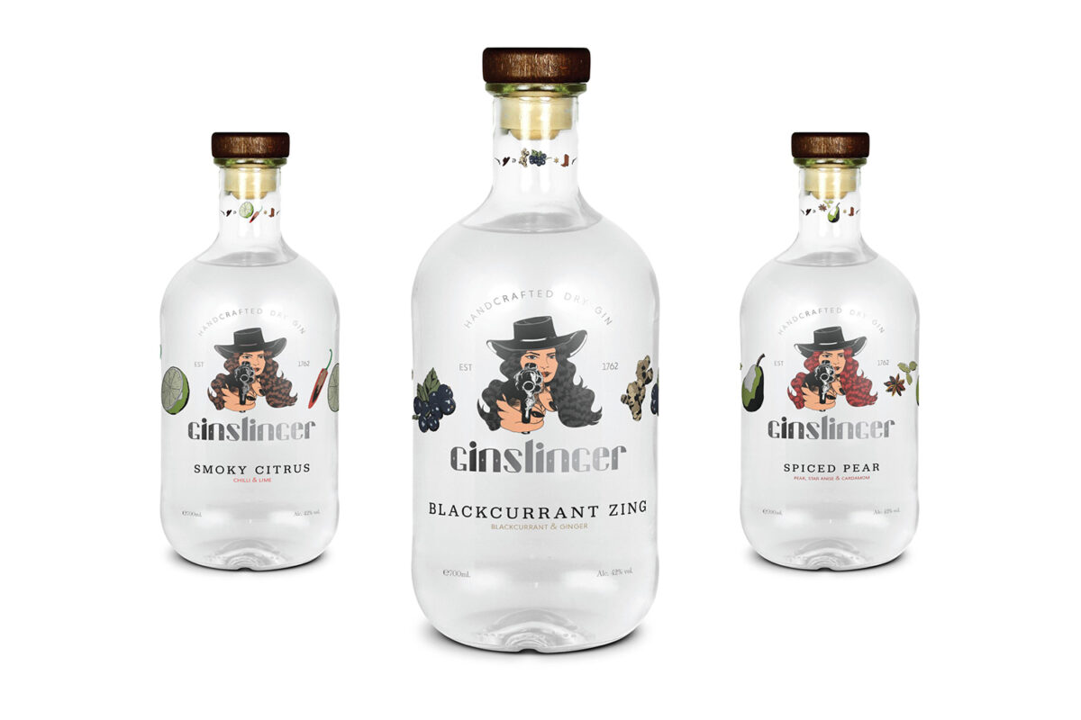
Create a custom typeface to be used in the logo design that reflects the brand story of being edgy and cool yet classy and a bit vintage. The logo design needs to also reflect the story of Ginslinger, playing into the theme of “Wild West”. Packaging design must heavily feature the logo, making sure it is recognisable on the shelves.
Rationale:
The brief required this brand to be edgy and “gangster”, but also classy and vintage, in order to capture the essence of the female-owned gin distillery. The concept behind this brand identity is that a woman can be pretty and feminine on the outside, but super strong on the inside (like Ginslinger gin). Wild West imagery and gin ingredients show the audience what the gin is made of: delicious botanicals and a badass vibe that destroys other alcohol labels with a single shot. The typeface was created for the Ginslinger brand to capture the gangster, yet Western vibe of the gin distillery’s origins. It is strong, yet classy with the feminine touch of the star.
