"Don't think outside the box, understand the box was never there."
This was a quote that my Design and Technology teacher would say to my class every lesson in Years 11 & 12. After two years of hearing it consistently it lost all meaning and purpose, until I began my degree and every lesson alluded to challenging and reimagining what we think design to be.
Over the span of three years in my course, I have gained a reinvented outlook on the world of design and have extensively grown in my skills and knowledge of Communication Design.
Whilst I've gained appreciation for all facets of design, I've drawn particular interests in the areas of branding, and more recently motion graphics. I'm very confident in using Adobe; Photoshop, Illustrator and After Effects.
What I enjoy most about Communication Design is that I constantly have something new to learn or a skill to further develop. I only look forward to furthering my knowledge and experience of design.
Looped
This project was for my Business by Design subject, and I had the great opportunity to collaborate in a team to create a viable business. Our project 'Looped' was all about keeping connected with your friends at a music festival, to maximise our patrons’ fun and safety.
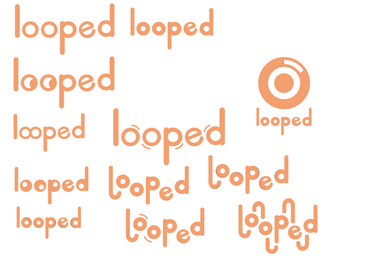
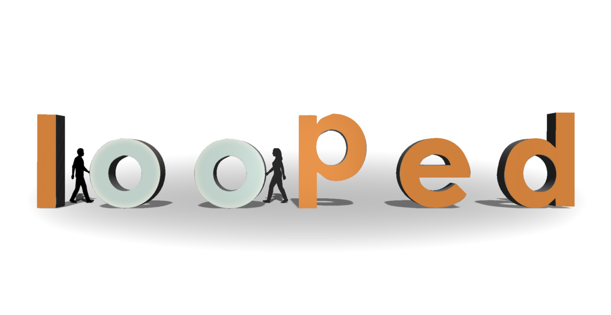
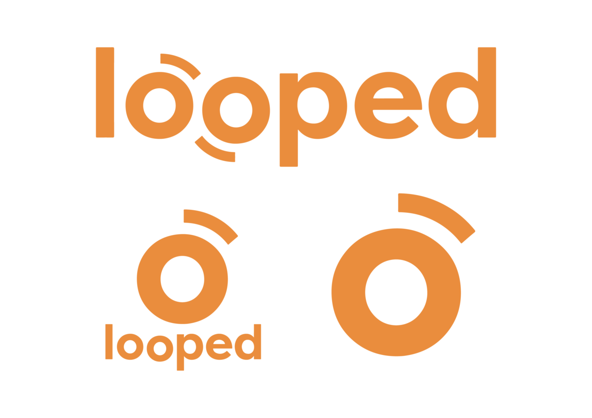
For this project I developed the logo, its variations and a motion graphic adaptation of the logo as well as a 3D interactive touchpoint.
This project challenged me to deeply consider the viability and feasibility of my designs and how the branding adapts to all facets of a project.
This project in particular sparked a deep interest in the work of brand development, and will be one of my favourite university projects that I've been a part of.
Royal National Park
For this project, I collaborated in a team to re-brand the 'Royal National Park' for our Typographic Systems subject. Our brief was to take an existing brand and redevelop its identity. We decided to take the traditional branding of the 'Royal National Park' and create a new modern identity for it.
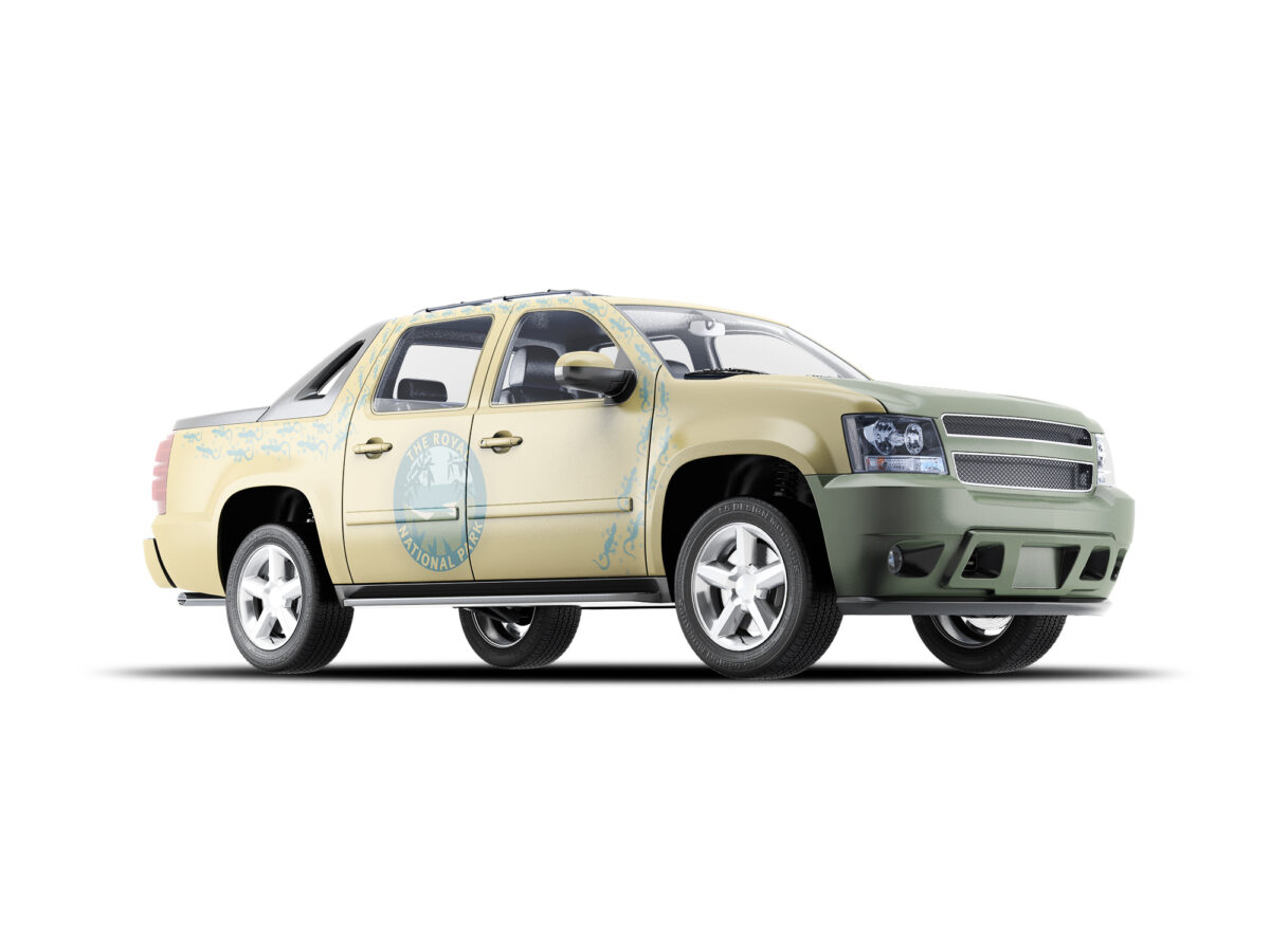
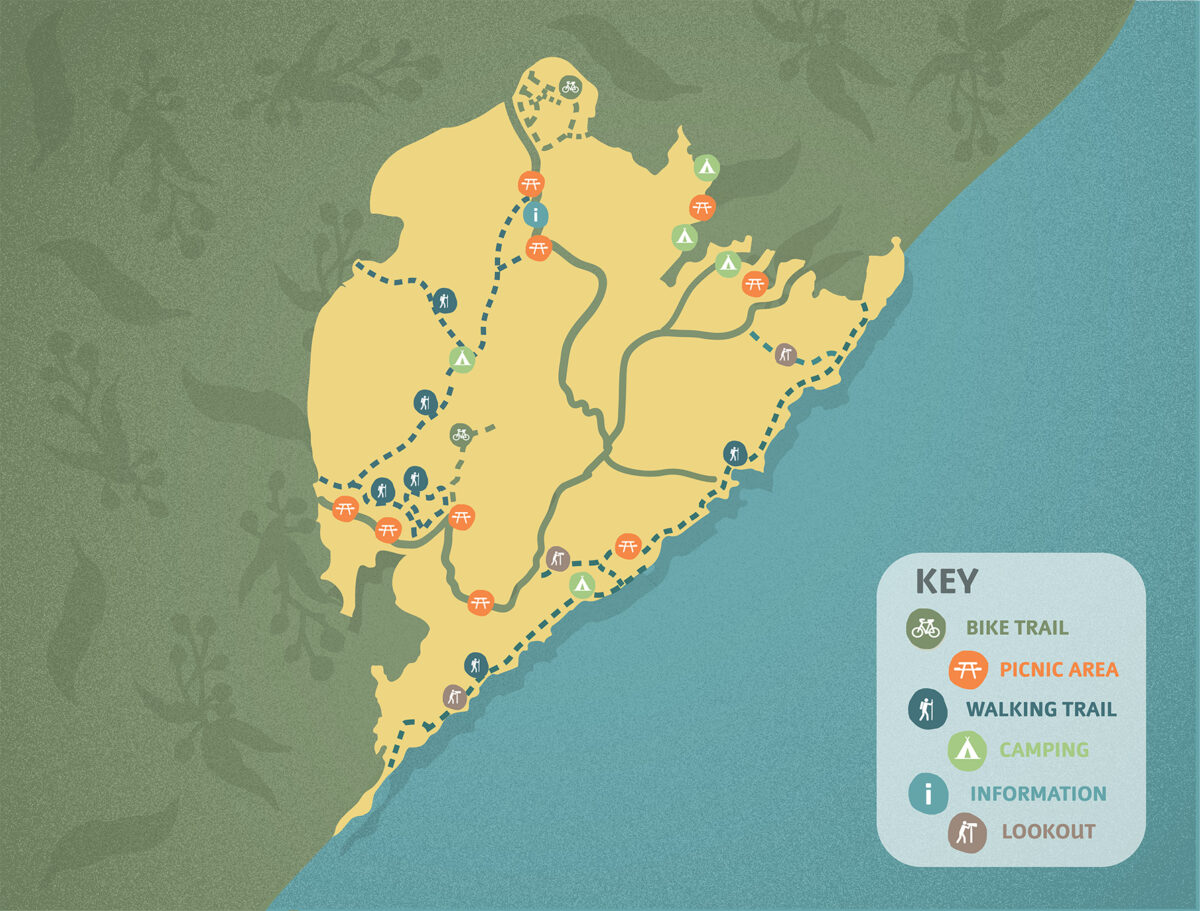
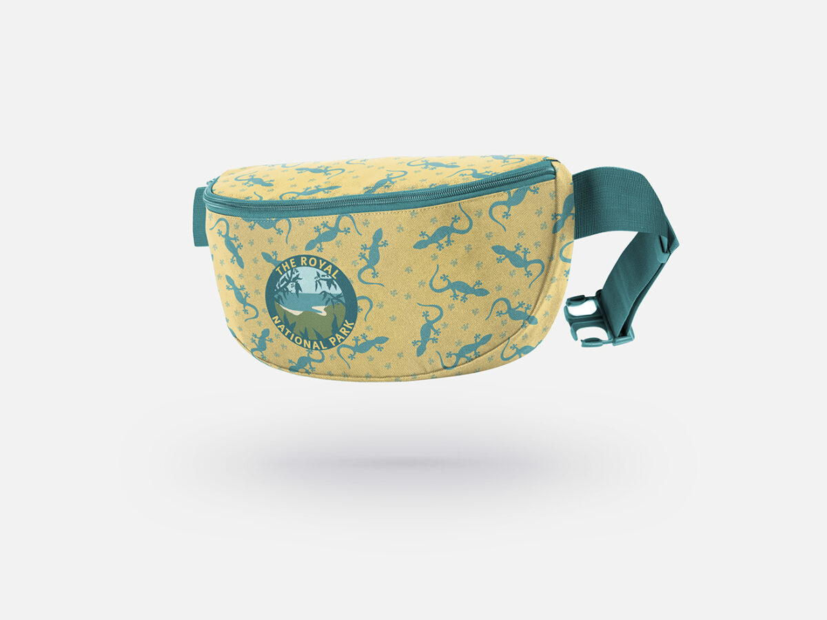
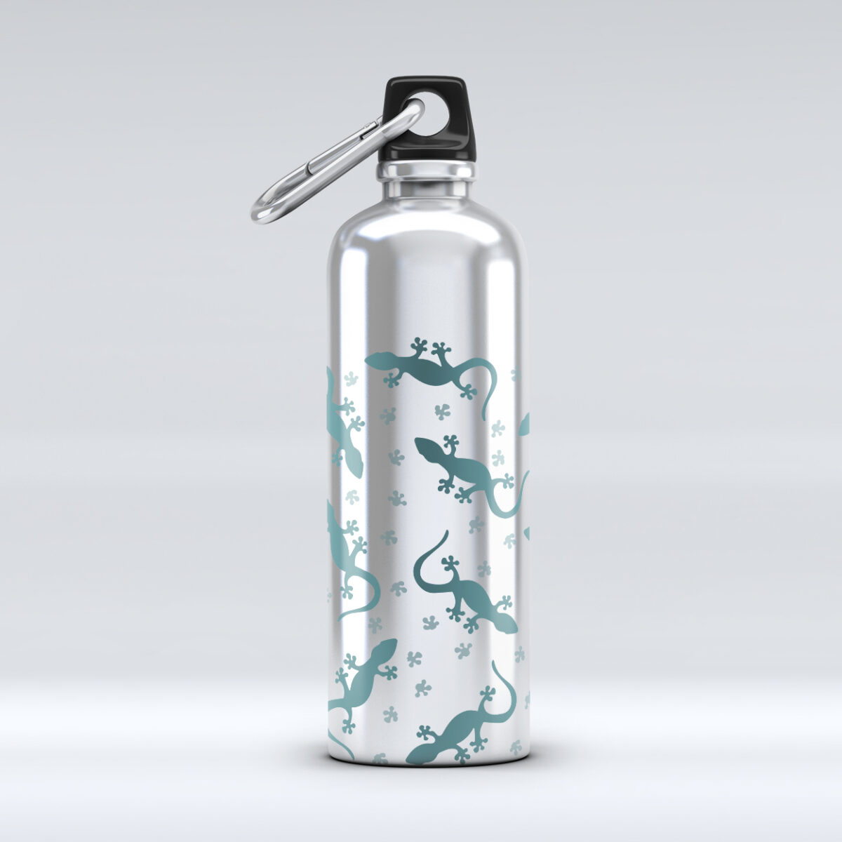
My contribution to this assessment was creating a park map to fit our new style guide, and developing a range of collateral including a bum bag, water bottle and ranger truck.
This assessment challenged me to take my designs and test their adaptability to a wide variety of mockups. Despite being content with my initial designs, I soon discovered their impracticality once placed in collateral. This was a great lesson for me in understanding how flexible designs need to be, and how the outcome of a project probably won't align with your initial thoughts and ideas.
*Note the logo was not created by me
