Hello, my name is Eloise.
I’m a junior designer based on the Central Coast, an hour north of Sydney.
I graduated from Billy Blue College of Design in 2020 with a Bachelors in Communication Design. I’ve also had career experience as both a makeup artist and a florist. I place a lot of value on these design foundational skills that I got to develop in those careers prior to my degree.
While there are things in design I enjoy such as typography, branding, packaging and anything in Illustrator, I am a true generalist designer who is willing to pick up or learn any new skill I can. I especially love those lightbulb moments when I combine different techniques and knowledge to produce something interesting.
I’m effective working alone or in teams. I can lead if the pace needs picking up, but I’m also good at following the direction of others. I thrive off construsctive criticism (and I frequently beg my design betters to rip my work to shreds, even if my ego is bruised for a bit!)
I prefer to communicate directly & honestly. Trendy, contemporary design is starting to look all the same. I am always on the lookout for new ways to do things (or take inspiration from really old things). I know that I need much more experience and exposure to other work to continue improving and perfecting.
Putting myself out there is nerve-wracking, anxiety-inducing and super exciting all at the same time. Thank you for viewing my work
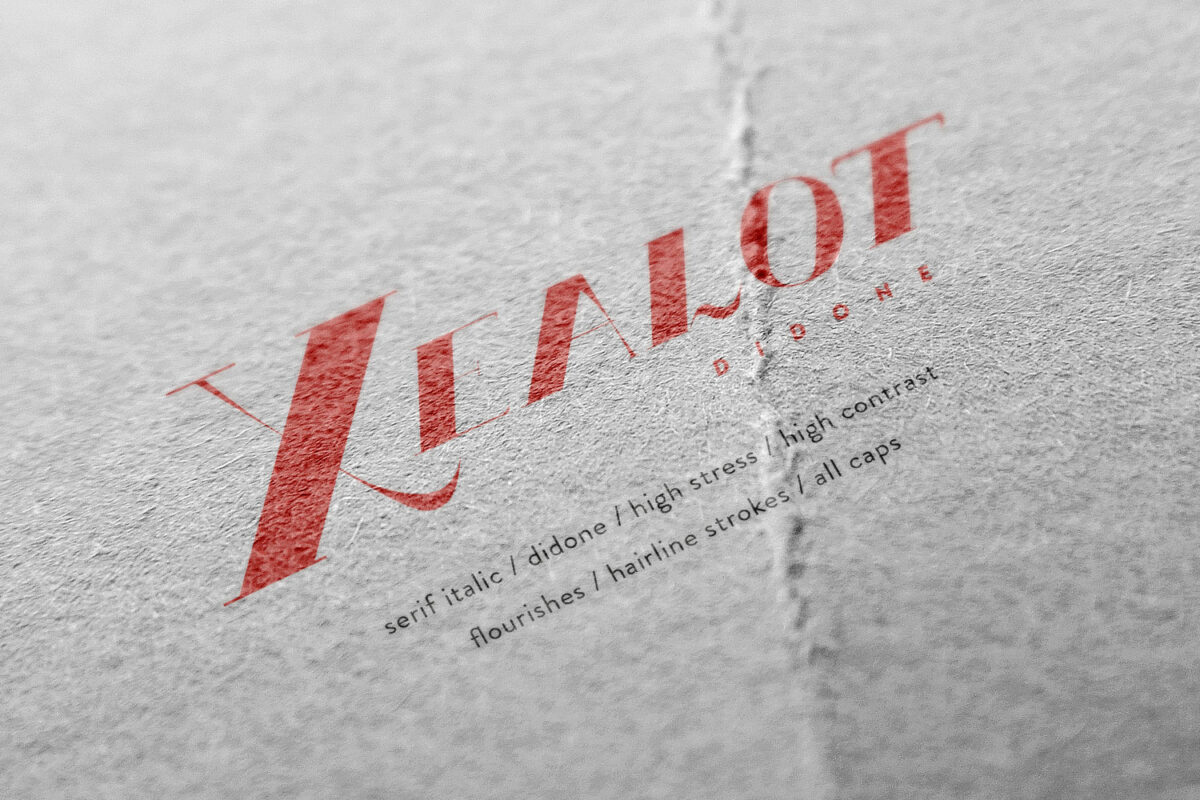
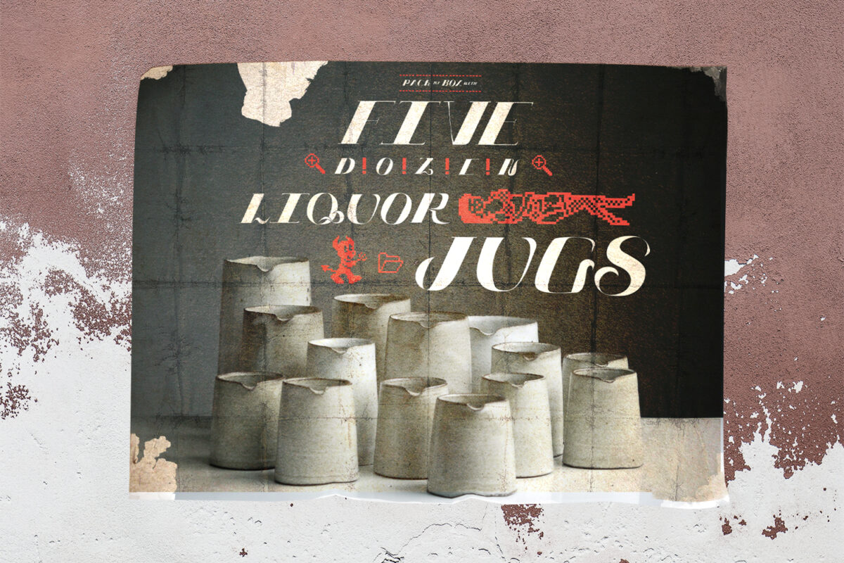
Xealot Didone
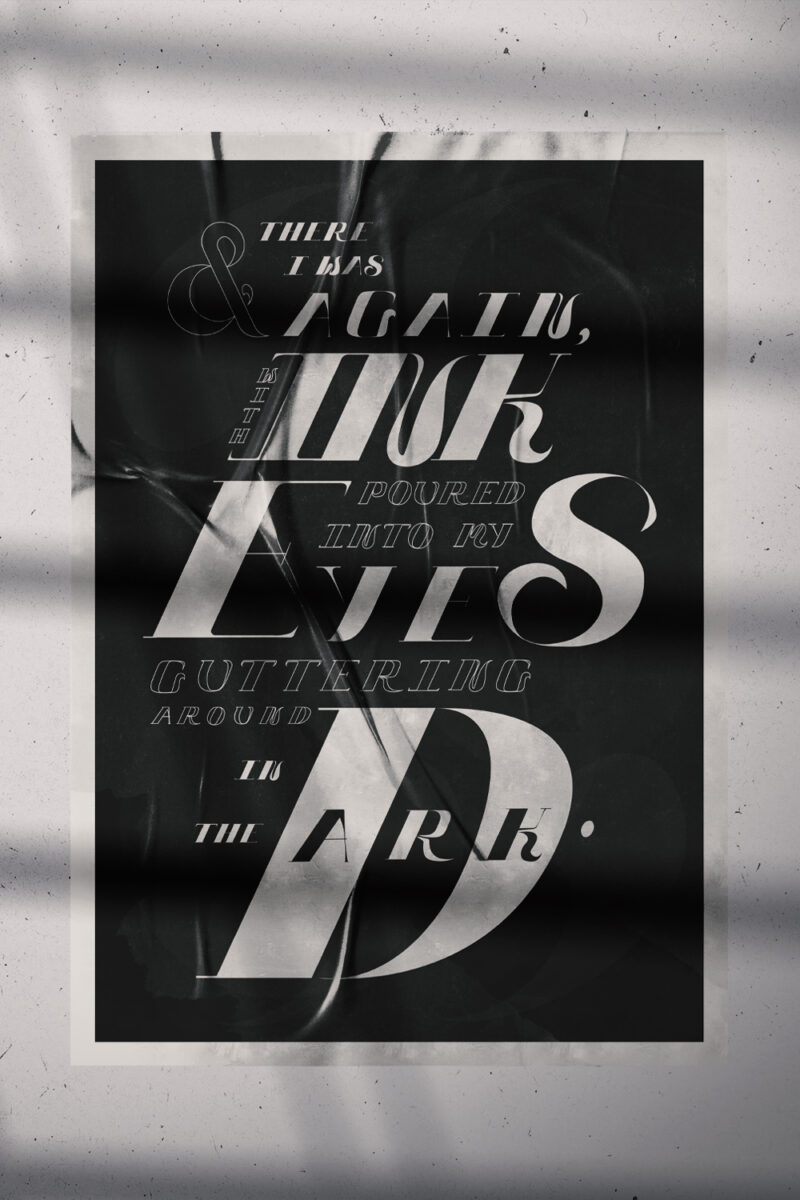
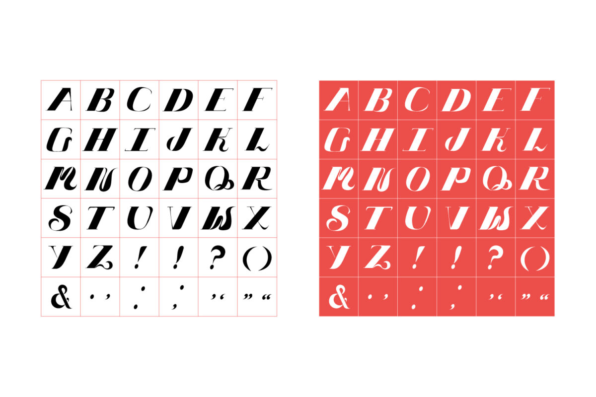
Xealot Didone is an experimental typeface inspired by modern didone serifs, calligraphy and 90's anime.
It could be described with the following typographic attributes:
Serif / Italic / Didone / High-Stress / High-Contrast / Flourishes / Hairline Strokes / All Caps
Bold, expressive and emotionally charged; it is a surprisingly versatile typeface. It is designed to be used in large scale mediums to best show off the extreme stress of the letters - print or digital, on light or dark backgrounds.
Influenced by the iconic typography in 90s anime classics such as Ghost in the Shell (1994) and Neon Genesis Evangelion (1995), Xealot is inspired by the strong serifs and flowing kanji featured in these works, particularly typefaces such as Bodoni and Matisse.
In these works, the subcontracting artists usually painted anything type-related in an anime by hand, so it was an unusual approach at the time for a director to use desktop typesetting to exert typographic control. This led to a very strong, unique and memorable typographic system within the shows; iconic for the time.
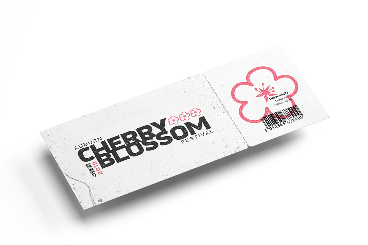
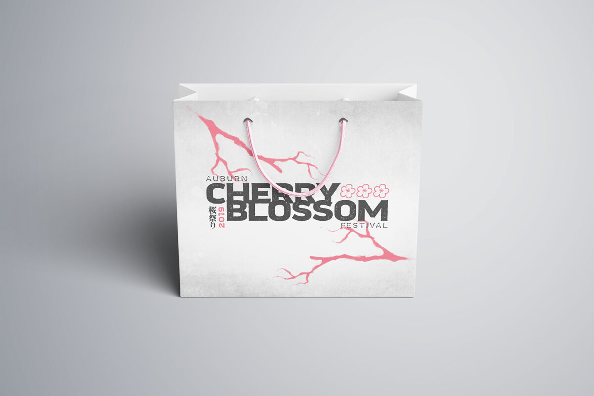
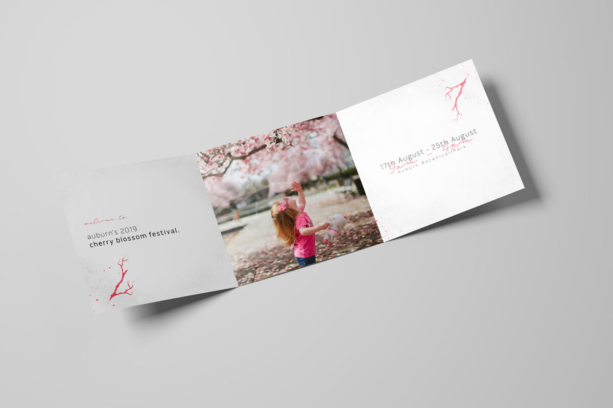
Cherry Blossom Festival
The brief of this project was to improve the broader appeal of Auburn’s Cherry Blossom Festival throughout Sydney. This means increasing attendance of locals and tourists along with the creation of consistent brand communication.
To achieve this, I developed strong, consistent branding to be used across all marketing, print and digital assets. I then developed an extensive plan to expand and integrate the festival into other areas of Auburn including the park, local business and a shuttle bus service from Auburn Station.
This project was important to me as it was a small but meaningful attempt to create a design solution without the gentrification of Auburn.
Western Sydney's suburbs have some of the lowest taxable income rates and growth in Sydney; residents are also divided emotionally and physically in cultural pockets.
Gentrification, the transition of a community financially from working class to middle/upper class status, is a pervasive problem in Sydney - symptomatic of a system that safeguards corporate greed and neglects low-income communities. This can create unfair displacement amongst locals.
The most sustainable way to foster long-term change for the better is by changing the attitudes of the people who live in the community. By spreading the festival activities and participation around different parts of the suburb, the aim is to increase local connections whilst avoiding entrenching gentrification further.
