Hello, my name is Cath Bird.
I’m a Graphic Designer and I have recently completed a Graphic Design Diploma at Torrens University – Billy Blue College of Design – to further my skills.
I also have business and research skills in graphic design, and currently run my own studio - Cath Bird Design.
I am industry experienced in finished art and print processes, art direction, logo design, photography and packaging, and most aspects of advertising.
I’m passionate about graphic design, collaborating with clients and providing creative solutions to complex issues. My goal is to secure a role with a great fun team of creatives in the design industry.
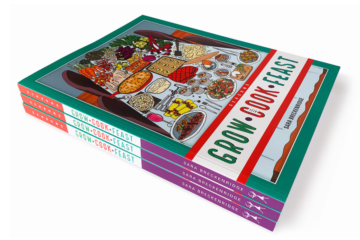
GROW COOK FEAST
A seasonal cookbook written by Sara Breckenridge.
Artwork and Design by Cath Bird.
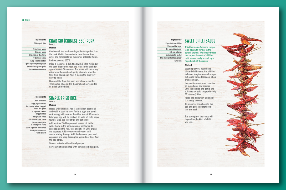
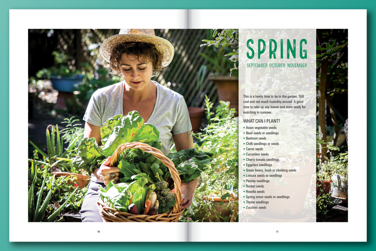
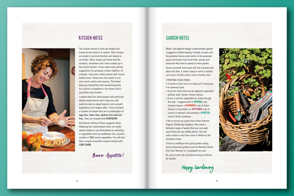
A very interesting project to create a book from a client’s dream. Starting with 180 recipes and a few professional photographs and a very limited budget.
The process of beginning – client meetings – exploration – initial planning – initial print quotes – timeline – executing and presenting the initial look multiple– many choices to be made – dividing the seasons up with recipes with valid photography – lots of revisions – final product – then OMG!!
The book is now on bookshelves and being sold on growcookfeast.com.au
Printed by: Paradigm Brisbane
Quantity: 400
Cover: Matt coated stock 350gsm with a matt cello
Text: Uncoated 140gsm
Binding: PUR Binding
Logos
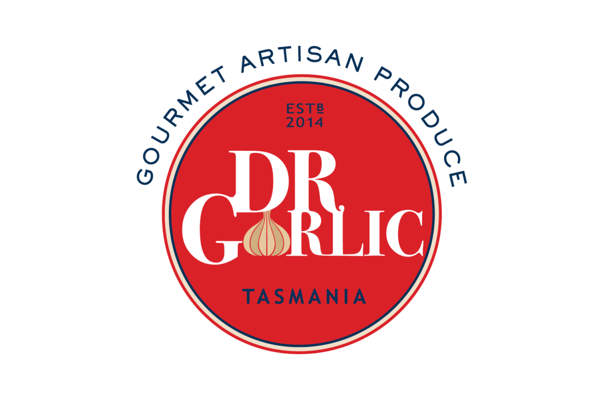
The DR GARLIC logo is about two friends coming together – Geoff Dugan and Rob Rolf. This is where the DR came in. The other connections were their neighbouring properties in Koonya, Tasmania and growing garlic. This rebrand project was a collaboration with Renee House as this was her client connection. We worked together, exploring and discussing ideas, then we proceeded using client feedback.
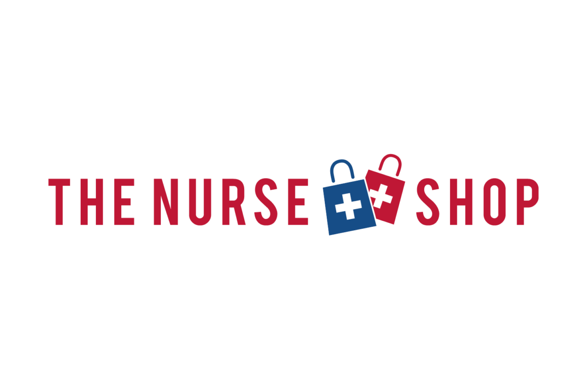
THE NURSE SHOP logo is a rebranded website for nurse supplies. The logo brief was to incorporate medical, modern and have a clean look. The client liked the medical cross and the bags, then adding colour psychology with RED for heart, attention, energy, vibrant, eye catching and stand out. BLUE for trust, health care, responsibility and calmness. A modern sans serif font was used – Bebas a condensed font with an open track around the medical shopping bags.
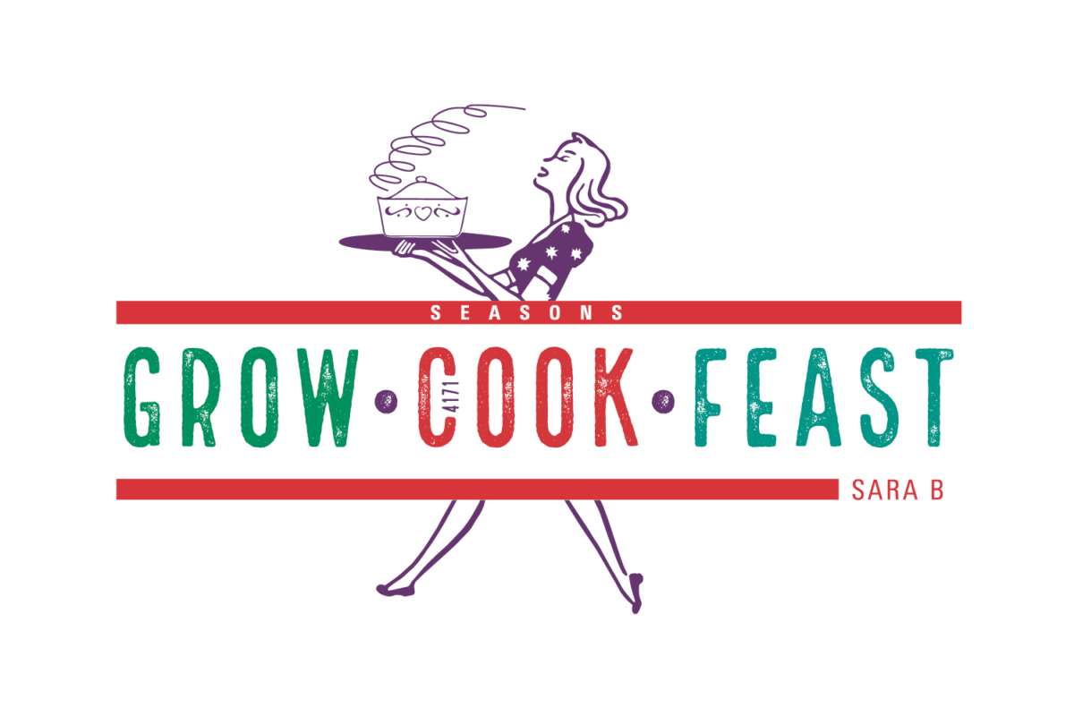
GROW COOK FEAST logo was created to accompany and promote the book as a brand. This logo incorporates the vintage look of a lady walking with a freshly cooked meal using fresh colours chosen from the illustration on the front cover. This logo will be used in merchandising for the kitchen-like aprons.
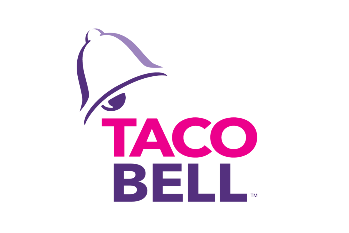
TACO BELL logo was a university project to take an existing logo and give it a refresh. To simplify the existing American logo and take the bell out of the bell tower, clean the shape of the bell and give it a tilt for a bit of motion. Then, to make the logo more playful, a small amount of pink was incorporated with the existing purple.