My name is Briony Young, owner and designer at Blackbird Grafix. I offer bespoke web and graphic design services for new businesses, start-ups and those looking for a brand or online refresh.
I have completed the Diploma of Graphic Design through Billy Blue College of Design. My areas of interest include branding and web design.
I enjoy being able to be creative and provide solutions for my clients' design needs. I am passionate about providing my design services to like-minded businesses, especially solopreneurs.
National Portrait Gallery Rebrand
Objective
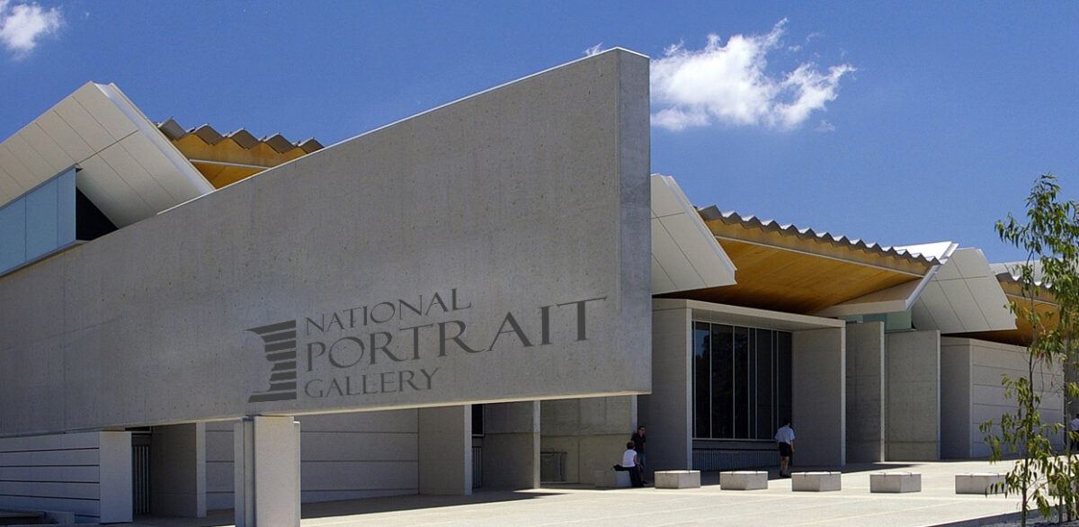
The objective was to review an Australian cultural institution that I considered would benefit from a rebrand. The National Portrait Gallery is the youngest cultural institution in Australia, showcasing various portrait artists.
Result
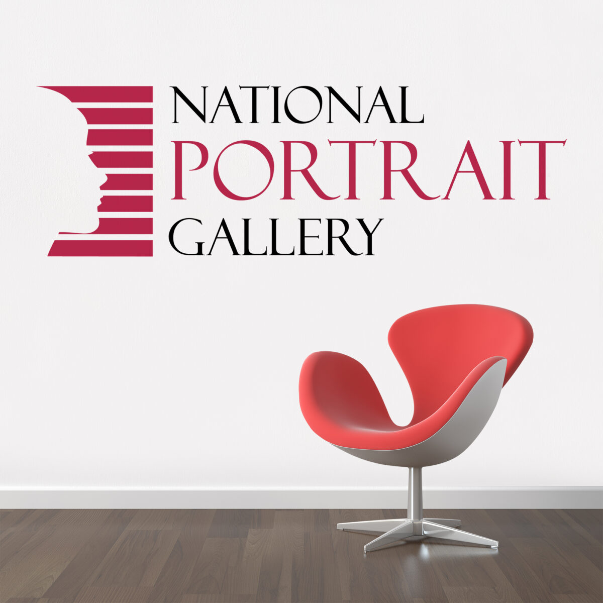
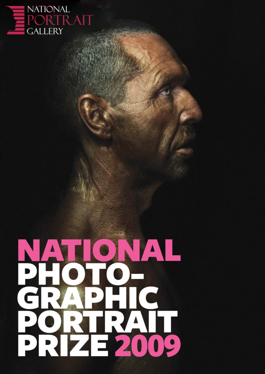
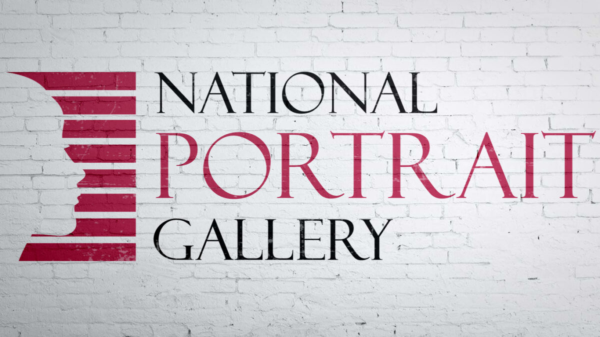
The final logo showcases a side face profile, to reflect the portraits that are on display within the gallery. The eight lines represent each state and territory within Australia, similar to that of the stone pieces that are laid within the flooring of the Gordon Darling Hall.. The muted red colour reflects the red of the Australian deserts and the red that is commonly used within Aboriginal paintings.
My main aims for the logo were to ensure it reflected the mission of the gallery as well as Australian culture, its warmth and natural beauty, but also keeping the logo modern and classy.
Bluesfest Brand Identity
Objective
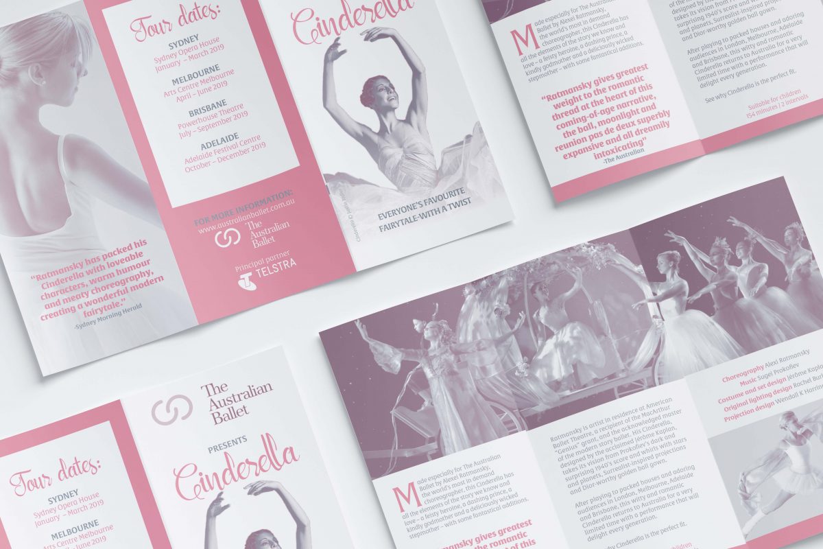
The objective was to design the identity and visual theme for an upcoming music event. I was required to develop the brand and a range of supporting collateral. This was to be a comprehensive re-brand and needed to be something radical that would differentiate the event as well as reflecting the overall vibe of the event.
Result
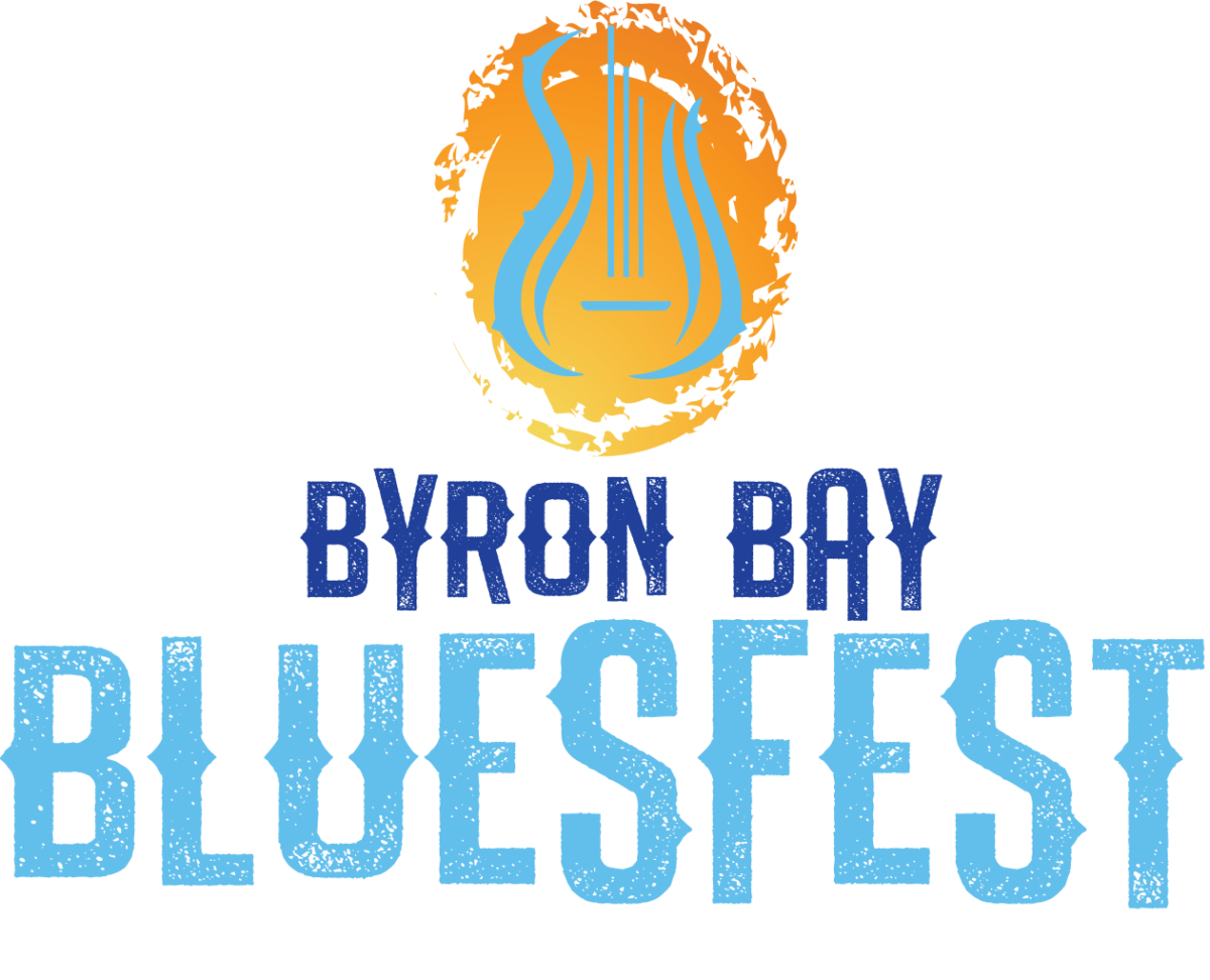
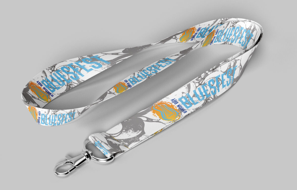
The final designs showcase the feel of Byron Bay and appeal to the younger generation. The use of blues and oranges give a warm coastal feel to the logo, while wavy lines in the logo mark to symbolise a guitar, leading itself to the blues genre, but also symbolise the waves of the ocean and the coast. I incorporated a bit of a grunge background into the branding collateral to help it appeal more to the younger generations without going too overboard. The logo and branding have a more contemporary and edgy feel, making the overall branding of the event distinctive, visible, adaptable, universal and yet still simple enough to not be too overpowering.
