Hi there! I'm Alicia, also known as the human behind ‘The Short & Sweet Creative’.
I’m an illustrator and graphic designer from Sydney, Australia with a recent Diploma of Graphic Design from Billy Blue College of Design.
From minimalist portraits to creepy gore festival logos - I like to experiment and stretch myself in different design and art styles. When put to the task I have been known to push myself under pressure to produce creative designs that are memorable and meaningful.
My love for drawing and storytelling started from when I was young with my dreams constantly shifting from being a novelist to an artist. When I found that Graphic Design and Illustration could combine my two passions I jumped in headfirst and haven't looked back. I would love the opportunity to learn from experts in the design industry and to test myself in new ways.
When I am not designing or doodling I can be found reading a new fantasy book, sipping on a warm cup of tea or re-watching/singing out loud to Hamilton.
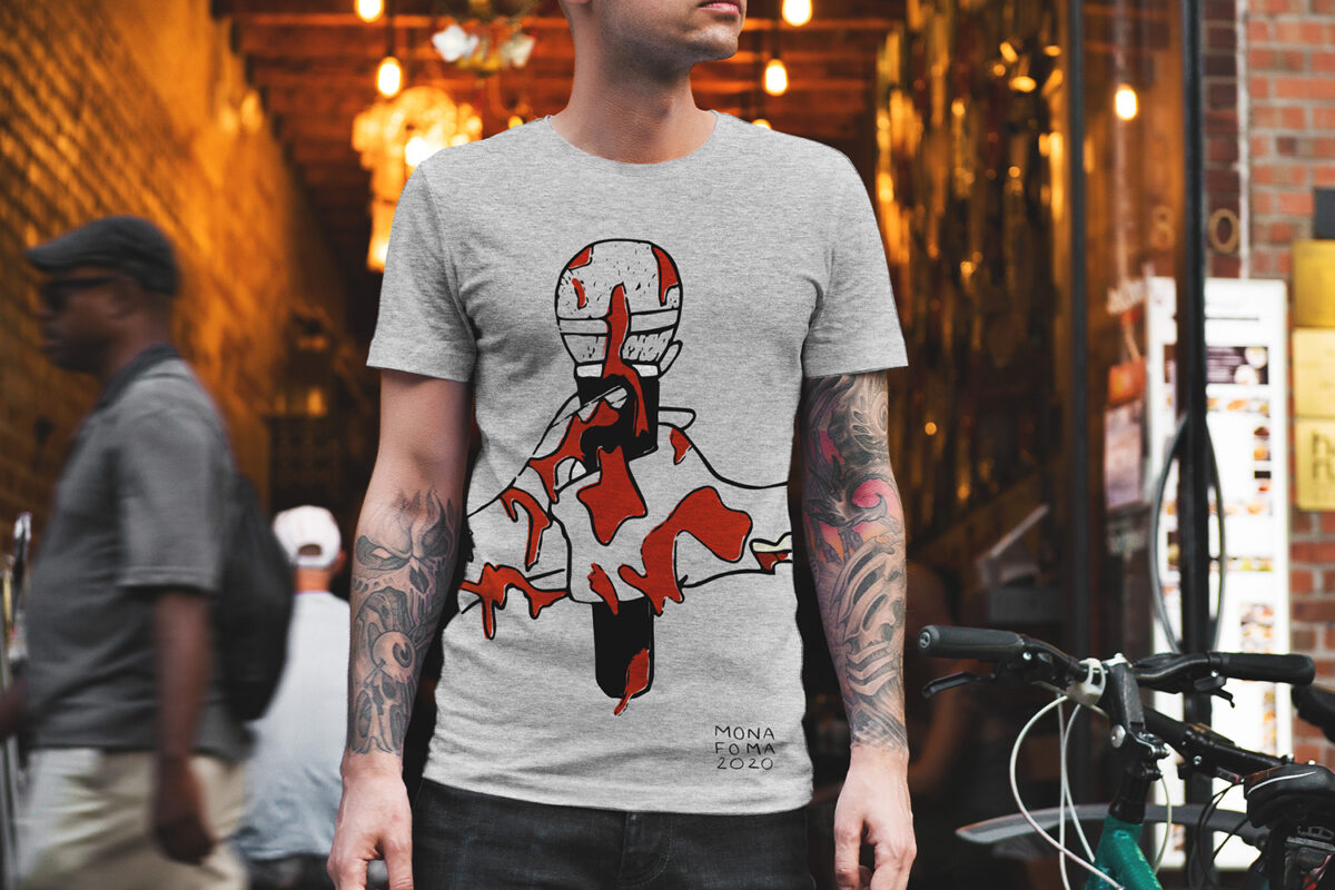
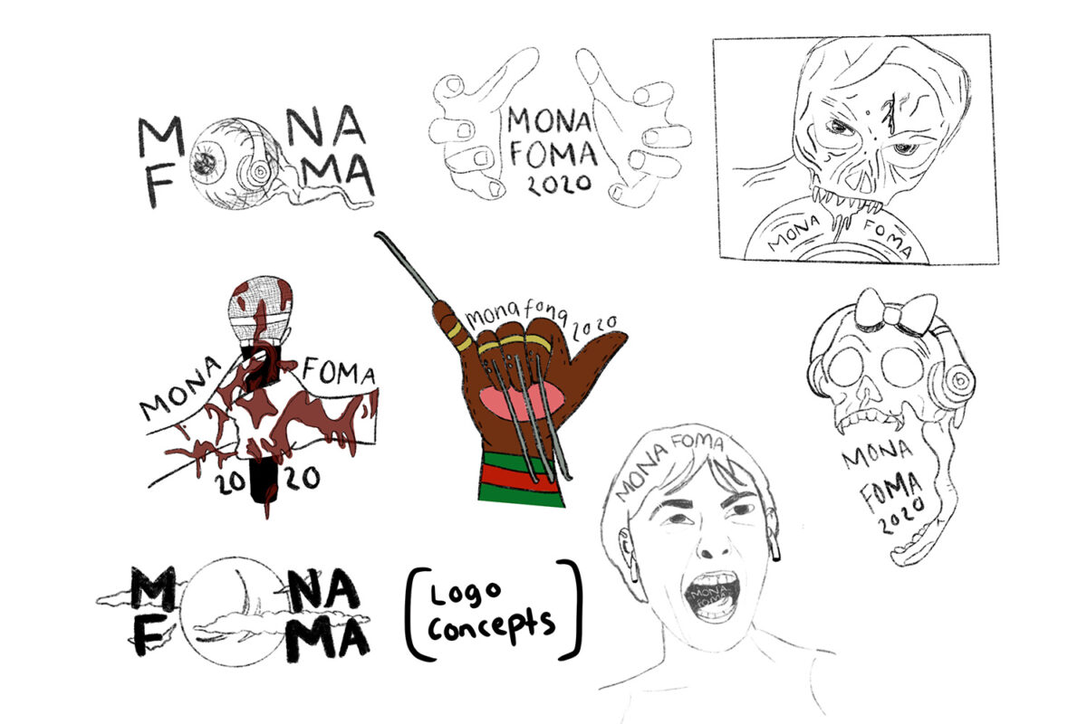
Mona Foma
Mona Foma is an annual music and arts festival that required a new theme for their upcoming 2020 event. This brief included the need for a fresh logo, secondary elements and merchandise design. Mona Foma is known for its eclectic and 'in your face' themes.
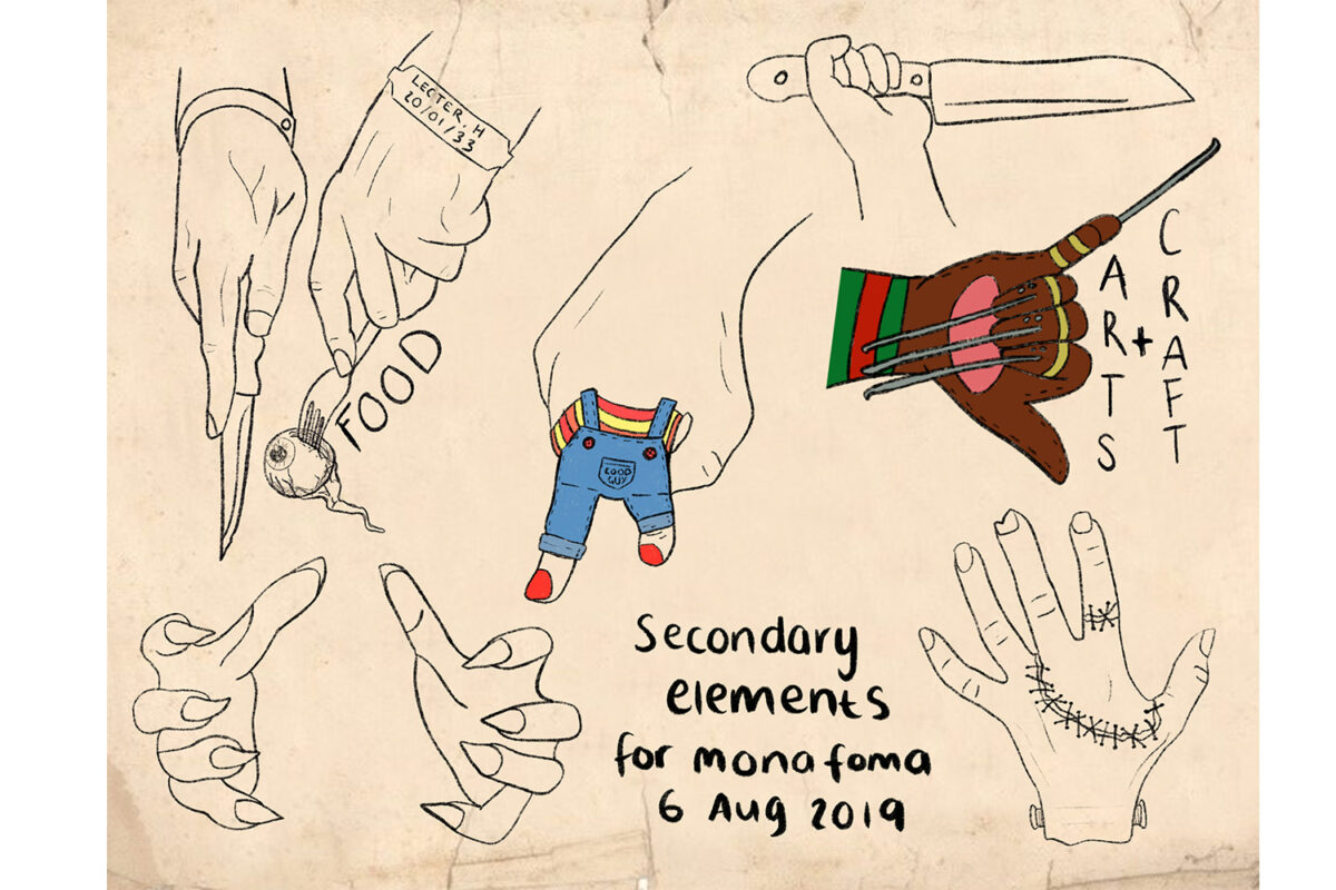
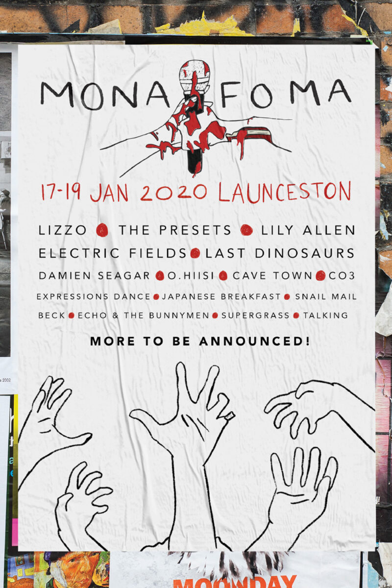
My 'Fright Night' theme brings together elements from classic horror cinema with a hand-drawn illustrative style. As you can see from my initial logo concepts, Mona Foma needed a recognisable logo that was consistent with the new theme concept. Taking horror movie tropes and a focus on musical elements such as microphones, headphones and vinyl, I came up with different logos that could pair well with the concept. For the final logo I had chosen the two bloodied hands grasping the microphone - a simple piece that can easily be scaled down and still be recognisable while also fitting in with the 'Fright Night' theme.
Using this logo I proceed to create posters and merchandise to promote the festival and its new theme. As my logo is focused solely on hands, I used that element across my secondary pieces which can be featured in various locations throughout the venue such as 'Hannibal Lecturer digging into a human eye' to indicate the food stands or 'Freddy Krueger tearing up the Arts & Crafts stand with his knives'.
This project is one of my favourites because I was able to try a different type of art style and dive into this creepy strange world.
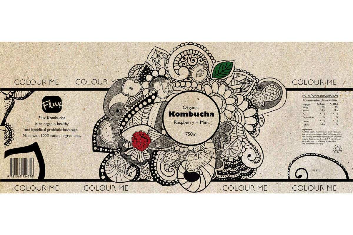
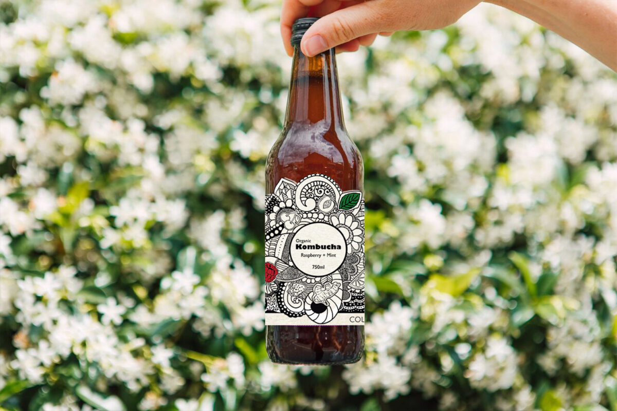
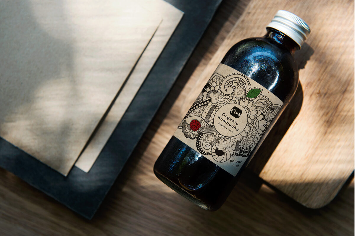
Kombucha
Flux is a new retailer of Kombucha health drinks and their first flavour to be released is 'Raspberry and Mint'. They required an engaging bottle label to help them stand out from their competitors.
The label I have created for Flux is a unique interactive 'colour me' label that is suitable for all ages. The label starts desaturated of colour with only its particular flavoured ingredients coloured in and embossed on the label. This label, next to all the bright vibrant Kombucha competitors, would already stand out on the shelf with its stark black & white - indicating cleanliness and an air of mystery.
The detailed New Age mandala-inspired label peels off easily and encourages the consumer to find a quiet space to drink their delicious Raspberry & Mint health drink while taking their time colouring in our label. Adult colouring books are geared towards relieving stress with their intricate designs; it is therapeutic to take your mind off everyday life and to just sit down and colour. That is why I created a design that would go hand-in-hand with a health drink; it gives the brand a purpose and vision that we are not only just focused on the physical benefits of drinking Kombucha but also promoting wellness and mental health.