I am a freelance analyst and designer who specialises in data analytics and data visualisation; infographics; and other data-heavy graphic design work. My work includes visual communication, layout, and design for annual reports, performance reports, policy documents, factsheets, infographics and web graphics.
My deep understanding of government, my familiarity with health and social policy data, and my visual communication and design skills, mean I am well-equipped to deliver unique insights into policy and data through bespoke data visualisation and infographics. My analytics and design skills are built on over 25 years’ experience in government and the healthcare sector, and extensive policy analysis, project management and strategic planning experience.
My qualifications include a Diploma in Graphic Design from Billy Blue College of Design, a Graduate Diploma in Internet and Web Computing from RMIT University, and a Masters in Public Administration from the University of Melbourne. I am also an accredited Project Management Professional through Project Management International.
Victorian Government 20-year statewide health plan publication design
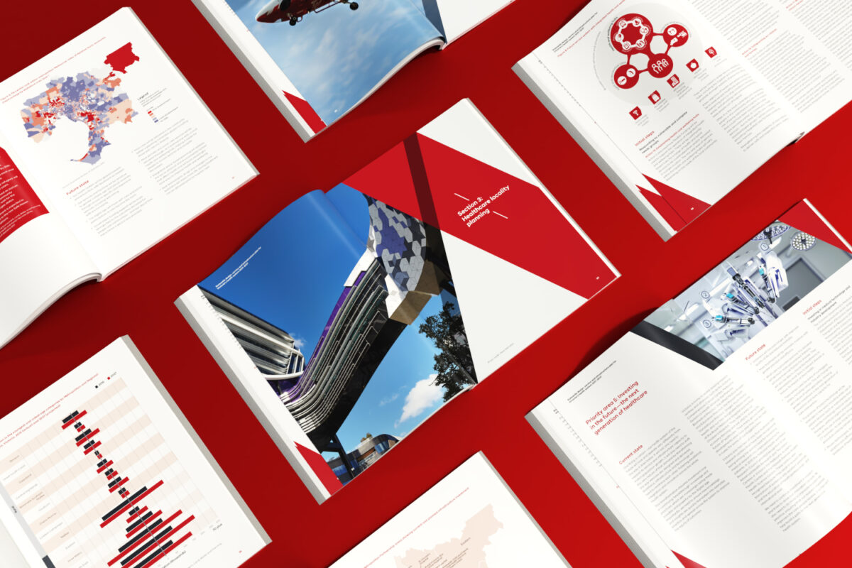
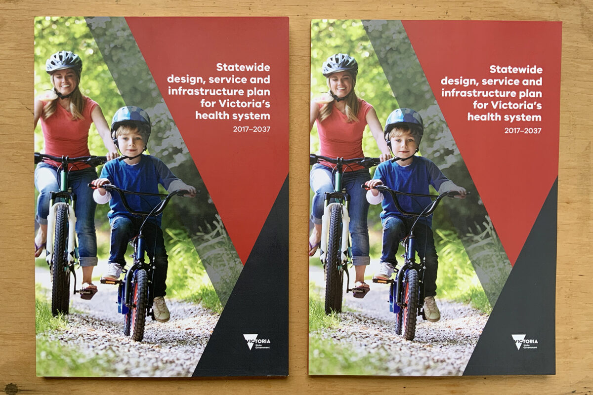
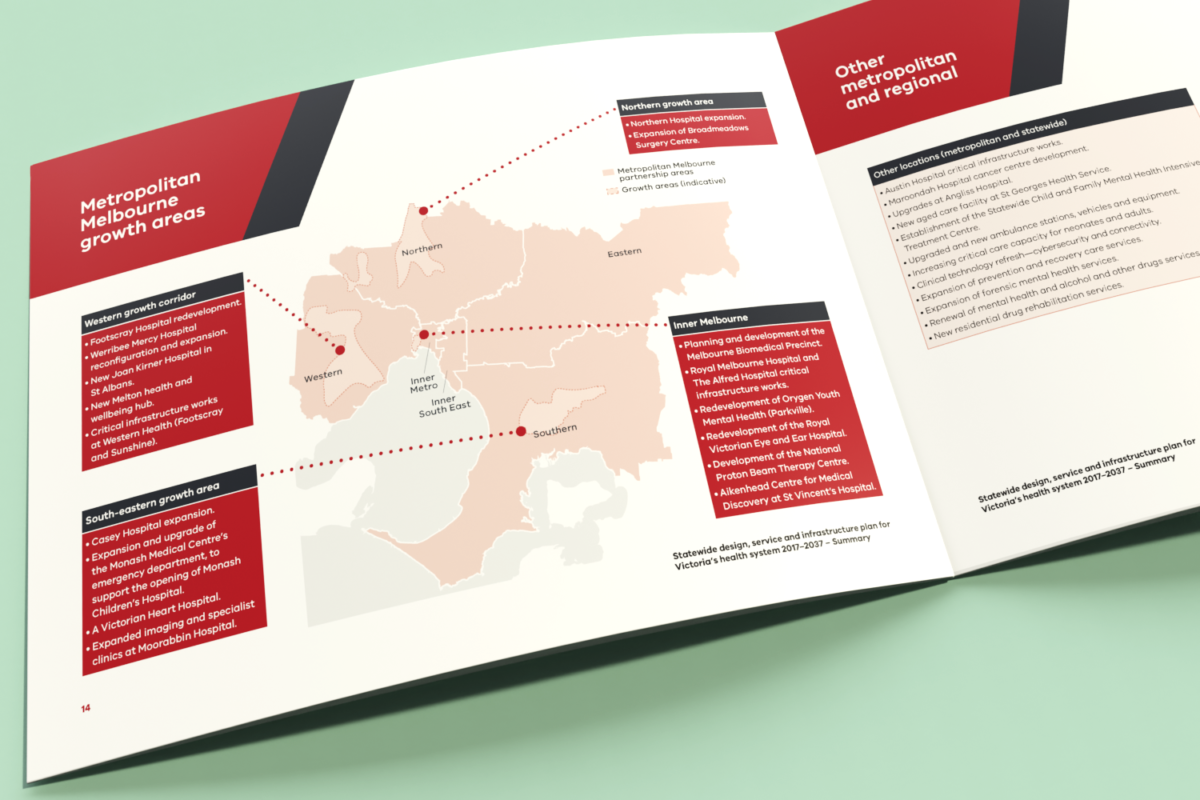
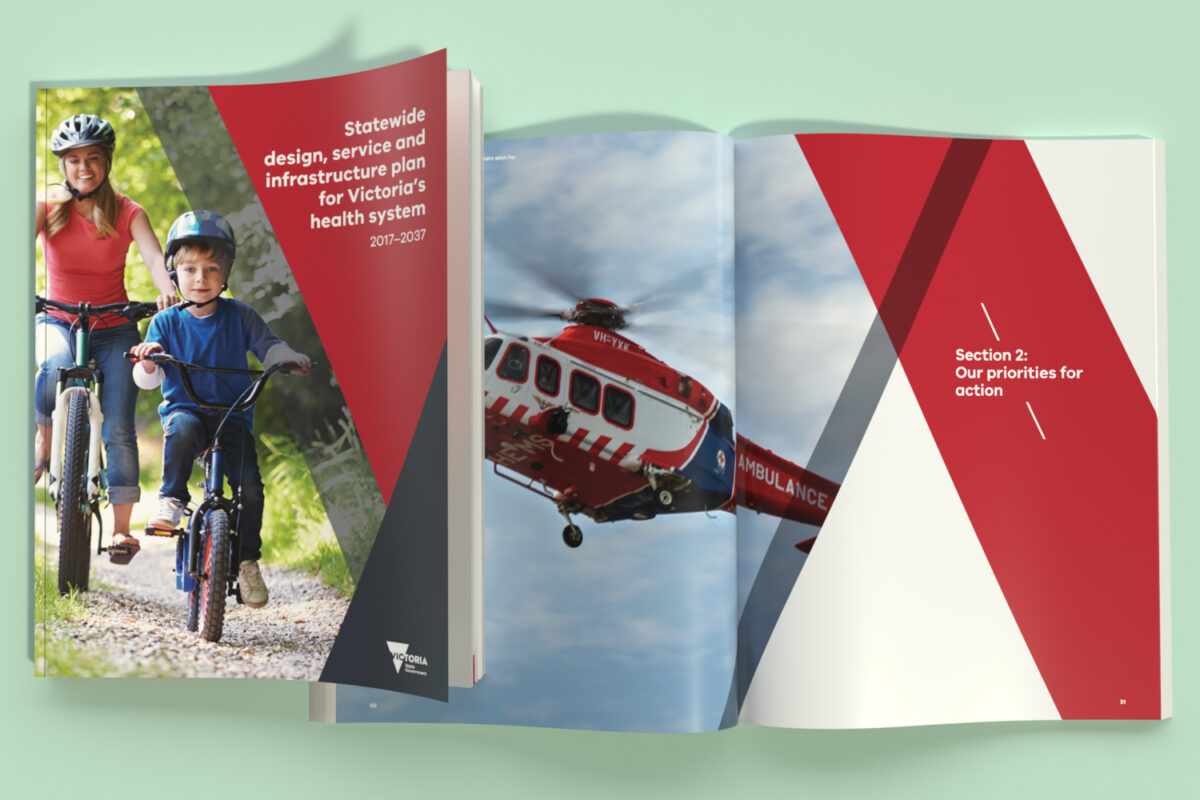
The Victorian Government Department of Health and Human Services engaged me to work with them on delivering their 20-year plan for the Victorian health system. I was involved in all aspects of the plan’s development, including content creation; editing; design of maps, data visualisations and infographics; image selection and editing; and document design and layout. Accompanying the main document was a companion summary report in landscape format, containing further maps, diagrams and infographics.
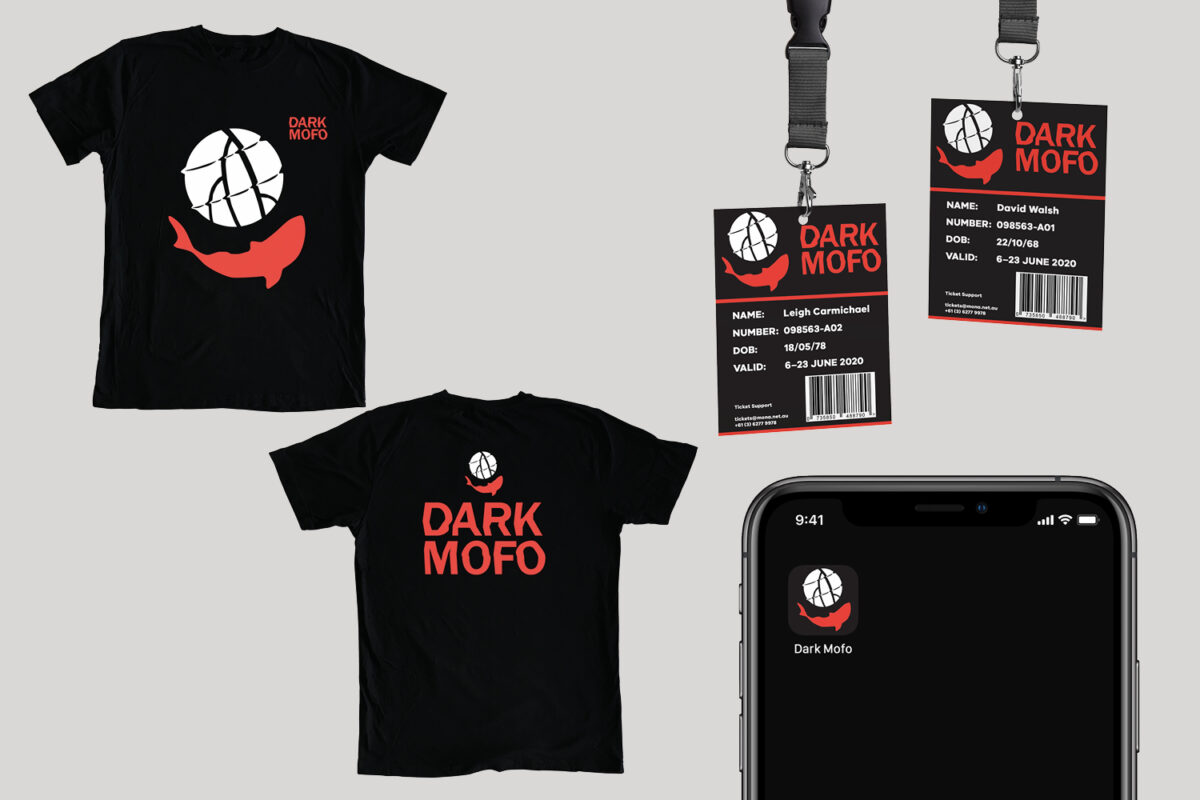
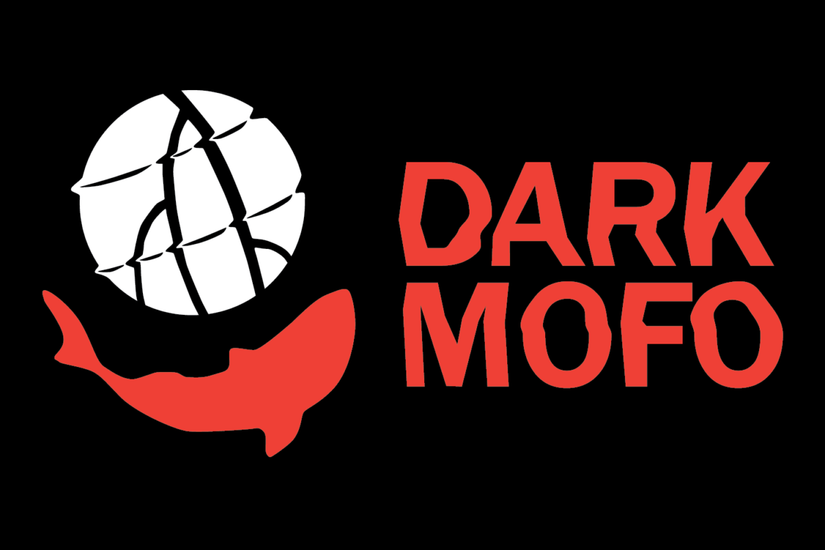
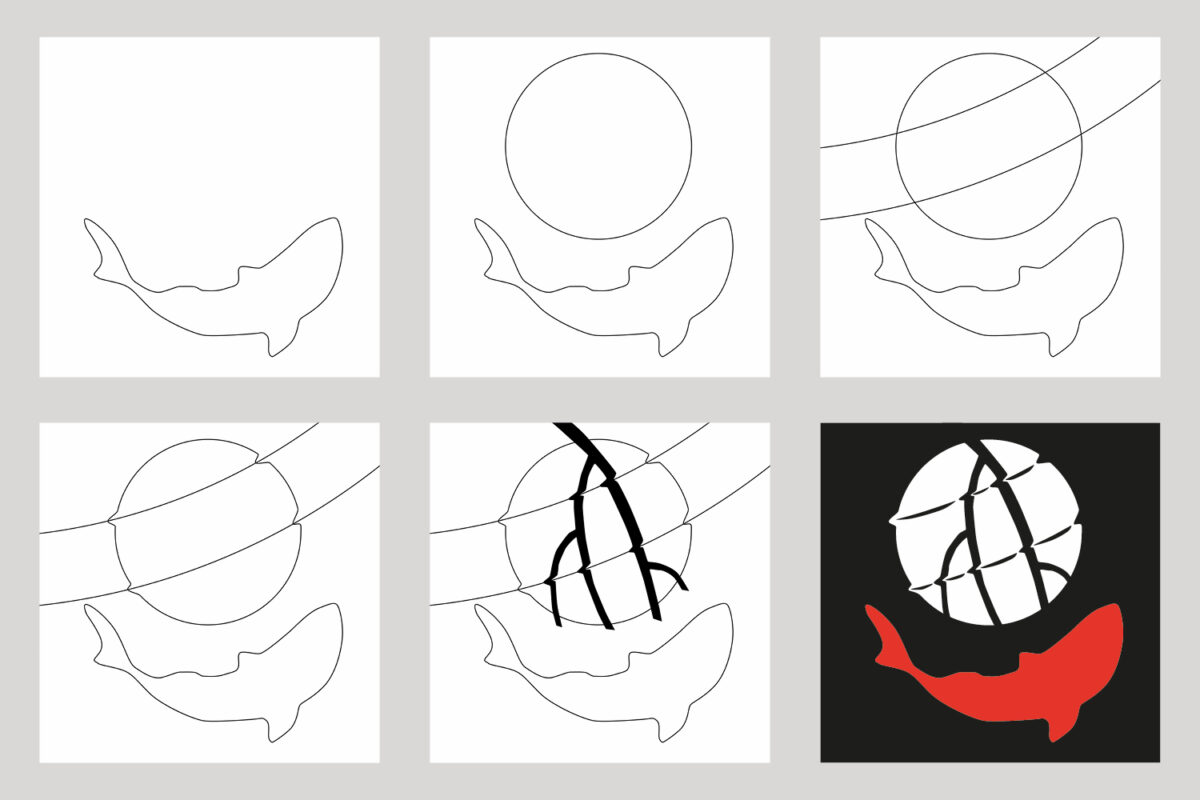
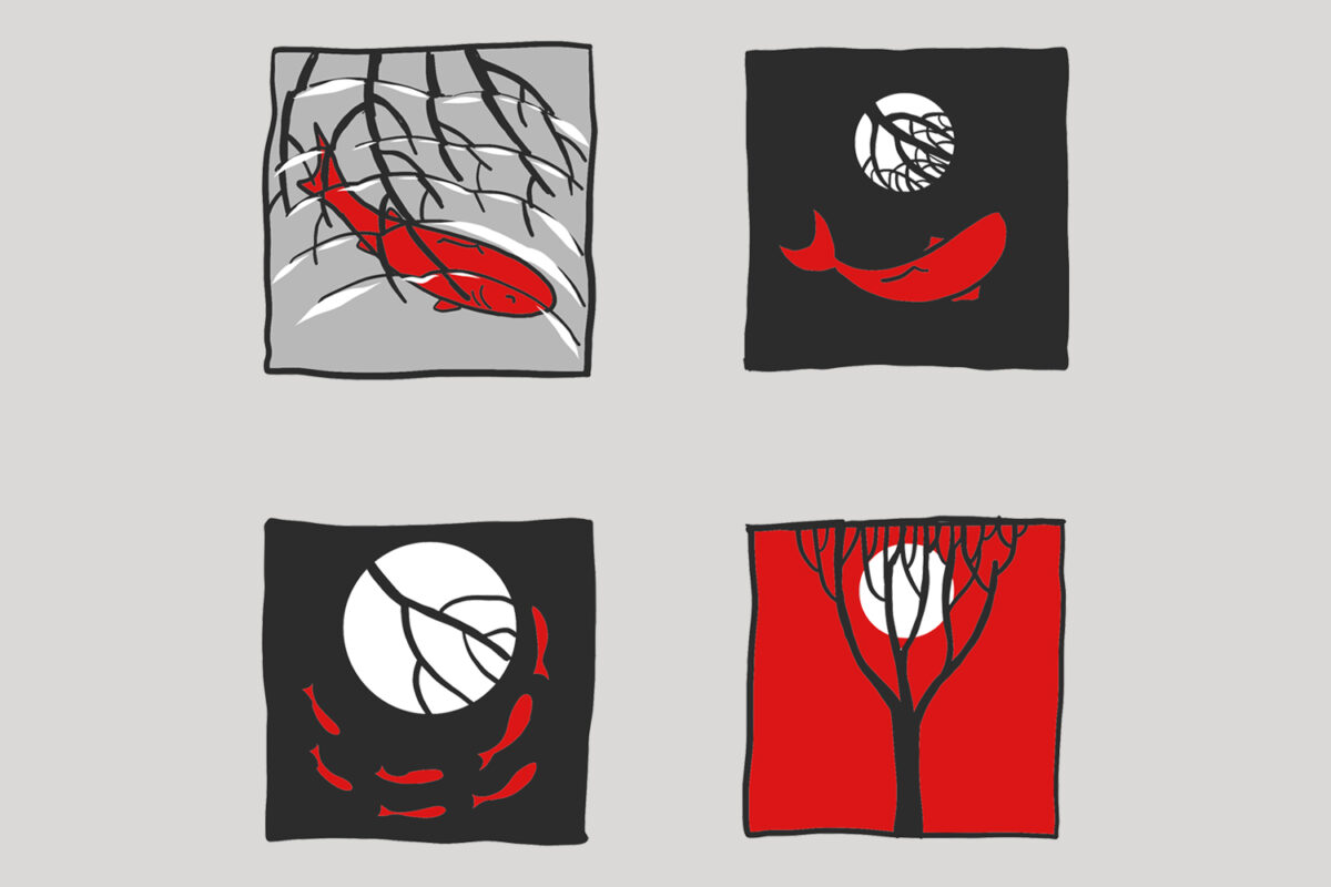
Dark MoFo 2020 identity concept
For this project, I created a new identity for Dark Mofo, the Tasmanian arts and music festival. Dark Mofo is the winter festival of the Museum of Old and New Art (MONA). One of the hallmarks of Dark Mofo (like MONA itself), is the combining of opposites – celebrating and highlighting difference and creating unlikely juxtapositions. The new identity captures this through its combination of dualities: dark and light, life and death, above and below, surface and depths. While rich in symbolism, the new identity is also very accessible, combining dark water, dark trees and a moonlit night to effectively evoke the Dark Mofo experience. The identity is effective across a range of collateral, working at different scales and using a simple, two colour layout and screen-friendly design. Its high-impact text, contrasting colours and solid shapes make it eye-catching and memorable. The proposed new identity for Dark Mofo moves away from the stark simplicity of the red/black cross used for previous festivals and introduces a more complex, symbol-laden logo that also retains a level of immediate impact and accessibility. It is a grown-up identity for a grown-up festival.