After working in various roles within the retail industry including visual merchandising, buying and planning, and management I decided to further my opportunities by embarking on a Bachelor of Interior Design (Commercial) at Billy Blue College of Design | Torrens University. During my studies I broadened my scope of abilities considerably. I look forward to applying the skills I have learnt throughout my career and studies into the creative development of every project.
My previous career and my recent studies have optimised my ability to remain highly adaptable during the creative process to ensure an empathetic outcome for my clients. What is most important to me is to create spaces that place a high value on human connection whilst being engaging and functional. Such spaces provide lasting value for clients, users and future generations.
T2 Tea HQ
Since its inception just over 20 years ago, the T2 brand has grown exponentially and has found a new home in the six green star building at 1 Bligh Street, Sydney, which aligns with the brand’s sustainability objectives.
Its positioning on the 22nd floor means that the space boasts panoramic views overlooking Sydney Harbour. The open plan layout allows its occupants to take full advantage of not only the harbour views but also plenty of natural sunlight.
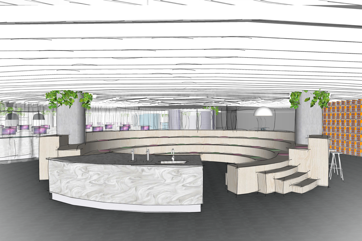
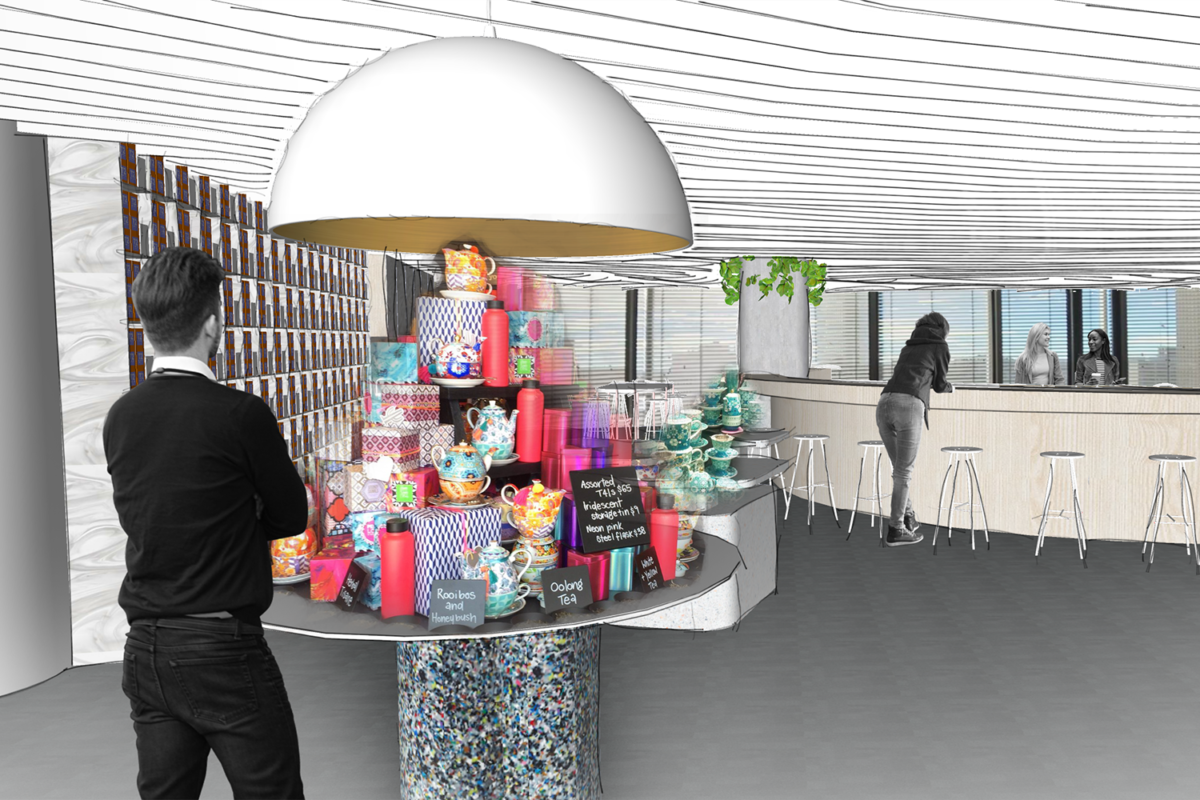
Comprising not just office space, there is a focus on a visitors’ front-of-house, staff training area and product and tea display.
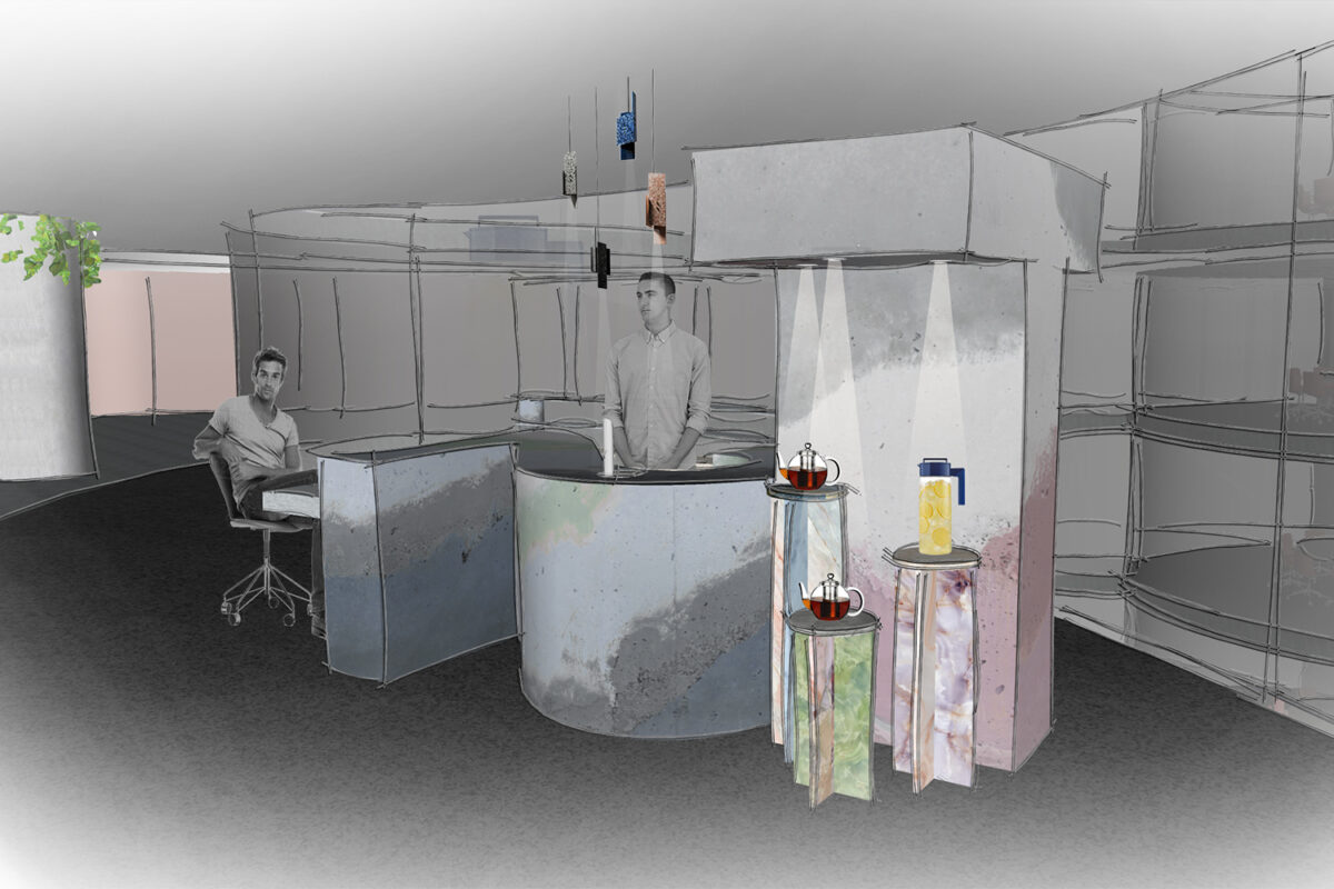
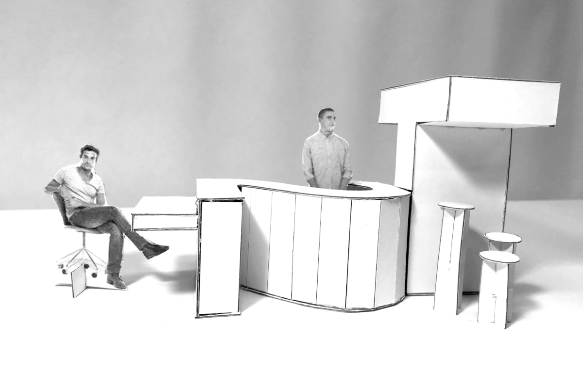
Upon entry, the visitor is greeted with current and upcoming products where they can look and touch, creating a sense of an in-store experience. Incorporated into this area is also a mini amphitheatre where training sessions and product launches can be held. References to the colours and patterns created when adding milk to tea were explored in the materials and finishes. This concept is reinforced through the layering of colours in the pigmented, cast-in-situ reception desk which is an abstracted form of the brand's logo. Here the visitor can sample teas highlighted in the brand's current campaign, once again referencing the experiential nature of the concept.
Boronia Kitchen
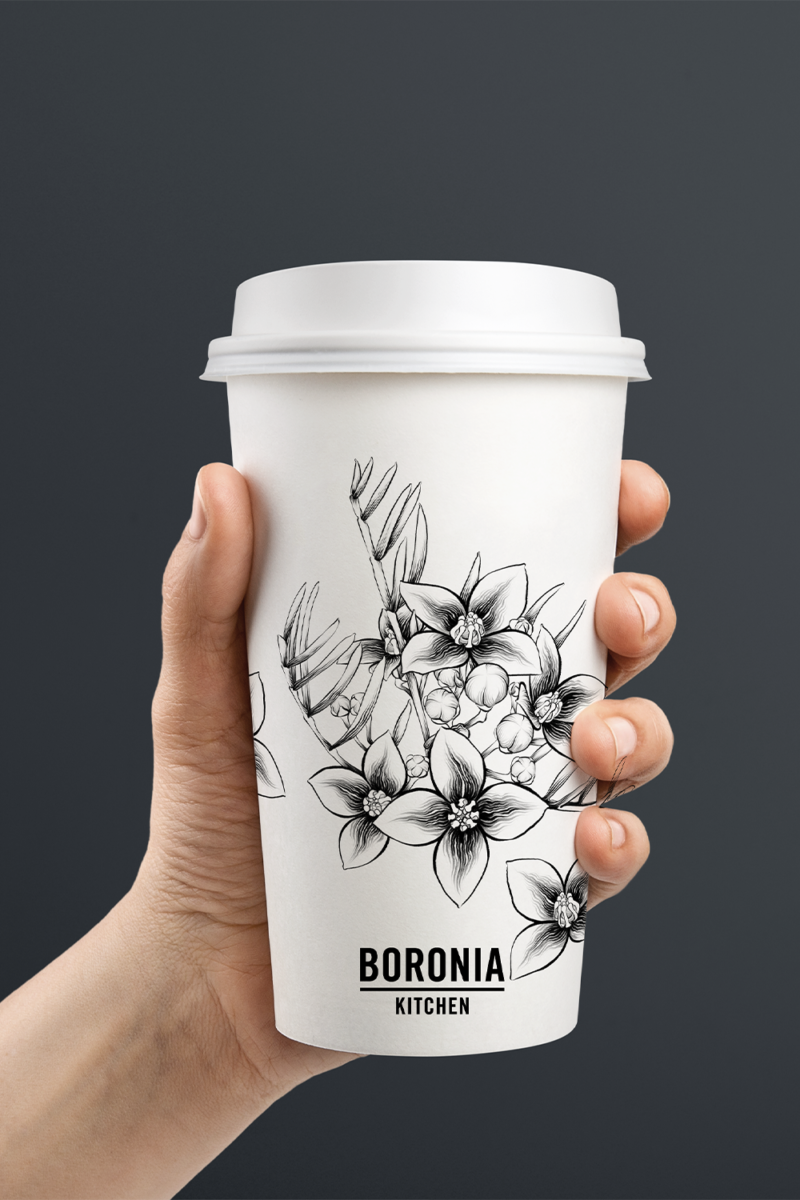
Boronia Kitchen is devoted to fresh produce, house-made ingredients and a relaxed atmosphere. Breakfast, lunch and dinner are on offer, as is an array of takeaway dishes for people too tired or busy to cook.
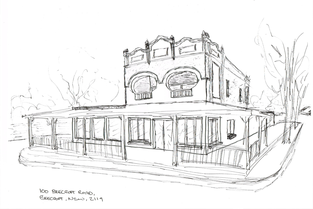
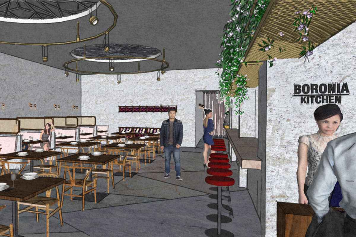
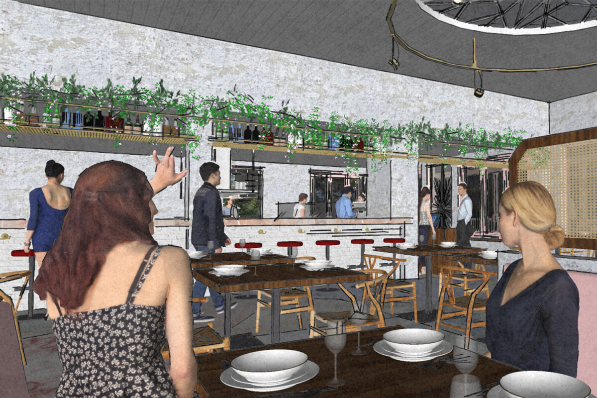
The site of the Beecroft location is an old corner store in Federation style, yet surprisingly not heritage protected. While there are no heritage restrictions, the design of the restaurant will remain sympathetic to the original building as it has become an important landmark to the Beecroft community. The design was kept fresh yet relaxed in keeping with the Boronia Kitchen brand. The colours and textures are reminiscent of a Wes Anderson aesthetic but restrained just enough to remain humble. Materials selected have let the beauty of the building speak for itself with exposed brick and concrete. The flooring consists of a selection of recycled marble which not only will be hard wearing but also create a point of interest. Timber veneer, burgundy leathers and brass detailing contrasted with the greenery of the indoor plants harks back to the Federation style.
