I’m a passionate artist, Textile and Graphic Designer, a postpartum doula and founder of Klostée and I love getting people excited about the things I’m excited about.
Over the years, I have graduated with a Bachelor of Applied Arts at UNSW-College of Fine Arts, a Certificate IV in Doula Support Services at the Australian Doula College and most recently a Higher Education Diploma of Graphic Design at Torrens University - Billy Blue College of Design.
I have had diverse experience with employment in textile design companies, art gallery placements, art exhibition curating, community volunteering and art workshops. I’ve participated in various group exhibitions and I have had a few solo ones too.
I love art and design and more specifically typography, branding, publication design and illustration. Through the years I cut my creative teeth in watercolour painting, fabric dyeing, photography, ceramics and sculpture, textile surface design and floor plan/room scene rendering.
When I’m not immersing myself into mixed media embroidery art, drafting magazine layouts and brainstorming innovative projects for clients, I’m trying my best to motivate, empower and impart my knowledge and experiences to others so they can find the same fulfilment as I have in my work.
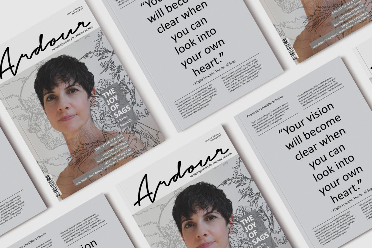
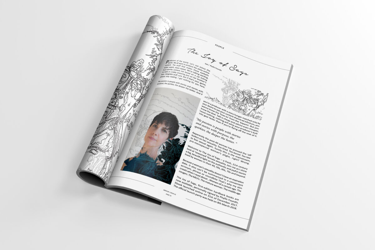
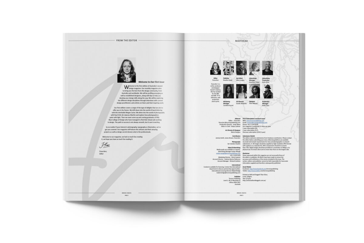
ARDOUR | Photoshoot & Publication Design
Ardour magazine’s primary demographic is women in design over the age of 30. The intention of Ardour magazine is to explore lifestyles of women in design.
Ardour is about creating a framework of personal and professional development, sharing knowledge, information and skills of women in design that are successful by applying specific habits, goal setting and dedication in order to overcome adversity and achieve success. This is a magazine of empowerment, encouragement and support.
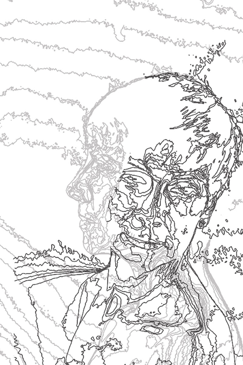
The completion and designing of this editorial required multifaceted organisation such as photoshoot direction, photo editing and illustration. It was an engaging and involved process in regards to layout design, image placement and typography considerations.
Software | Adobe Illustrator, Photoshop and InDesign
SPLENDOUR IN THE GRASS | Festival Marketing Rebrand
Splendour in the Grass is an Australian Festival held at Byron Bay of NSW.
Splendour in the Grass is a multifaceted event that draws national and international crowds and performing artists. They take pride in creating a safe and secure outdoor event that accommodates people of diverse backgrounds.
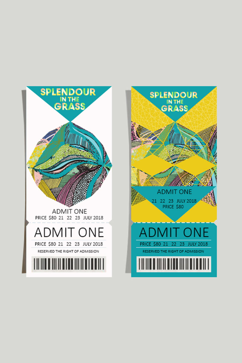
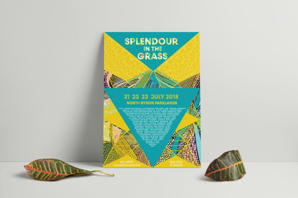
For the rebrand of the festival, I thoroughly researched and found inspiration in the key elements that I identified in the organisation. These were: drawing inspiration from the outdoor location of the festival; the tipi accommodation; the energy, fun and joy of the attending people; the creativity and the variety of performances.
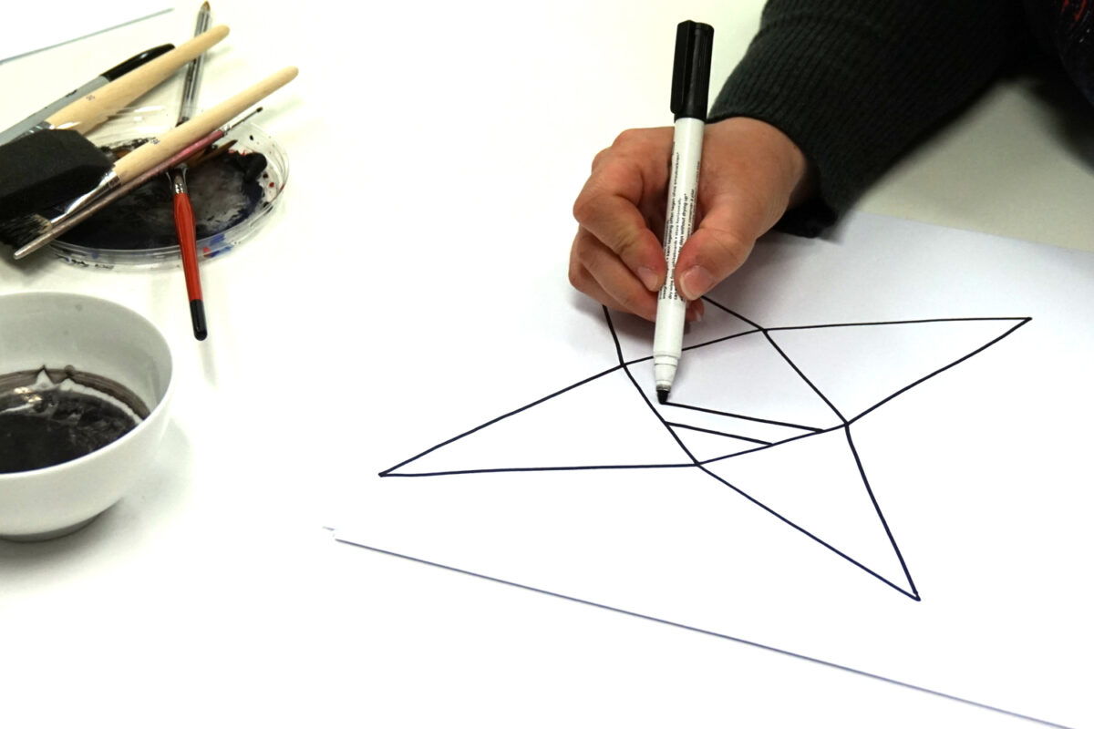
Pattern choices include elements of the tipi shape (triangle), fractal and prismatic shapes and grids inspired by the bohemian, ancestral, healing and sacred geometry aspects of the festival.
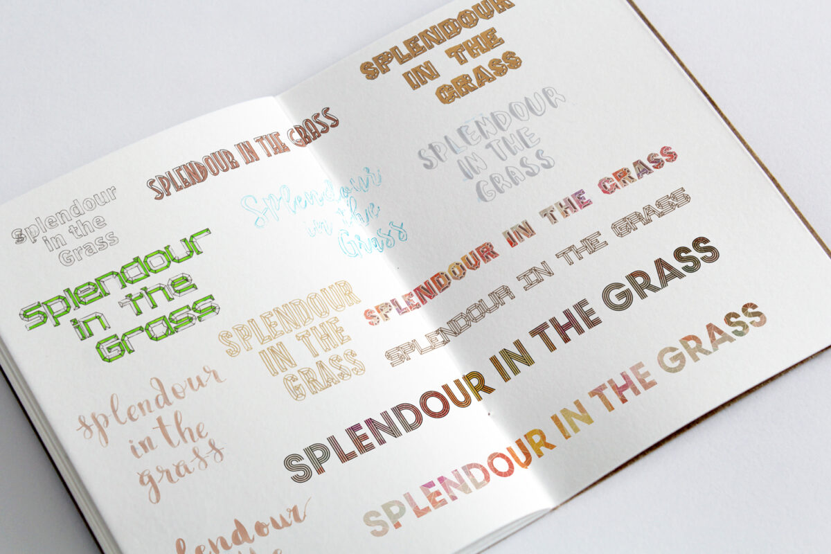
The typographic choice was an extension of reflective shades of diamonds, fractals and prismatic shapes that would pair with the pattern and colour choices. Aiming for a simplified typographic style would be readable and legible and would be making a bold statement with the type body.
Software | Adobe Illustrator and Photoshop
