Throughout my life I have loved creating art for myself and for others to enjoy. As a child, my favourite hobby was to draw and given any opportunity there was a doodle to be done - even if that meant drawing on the covers of my school books.
Since then, I have dabbled in different creative outlets from studying ‘building and design’ where I obtained my draftsmen ticket, to designing my own clothing label - Lklsrce, where I flipped my garage into a workshop studio, spending many creative hours designing and screen-printing. These creative outlets have seen me grow and develop as an artist, and have led me on my journey to graphic design.
I enjoy challenging myself and being challenged. I am inspired by my surroundings in everyday life. Attention to detail is one of my greatest strengths; I am meticulous throughout my design process and always endeavour to bring only my best work to the table. I am very motivated and passionate when it comes to art, fashion, design and creativity.
The following artworks have been carefully selected for your enjoyment.
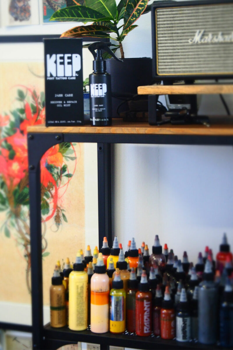
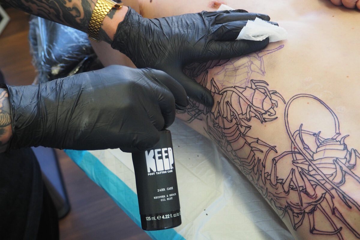
Keep
Scope:
Create packaging for a product of choice to submit to the AGDA design awards .
Reflection:
Designing a product that resonated with me provided the opportunity to evaluate personal experiences, allowing me to make precise refinements and innovative solutions to the packaging design. This is based around a human-centred approach.
The focus of KEEP was to inject a sense of care, trust, longevity, permanency, healing properties and instant relief which I set out to achieve through the use of typography.
Tattoos are works of art but most importantly they are personal and permanent. The relationship that a tattoo artist has with a client is professionally intimate with a bond set around trust.
These values and qualities are something that I wanted KEEP to reflect and possess through visual representation and functionality, essentially tying in a familiar and emotional experience .
KEEP has been designed to align with the tattoo industry with the premium black packaging and its visually artistic design.


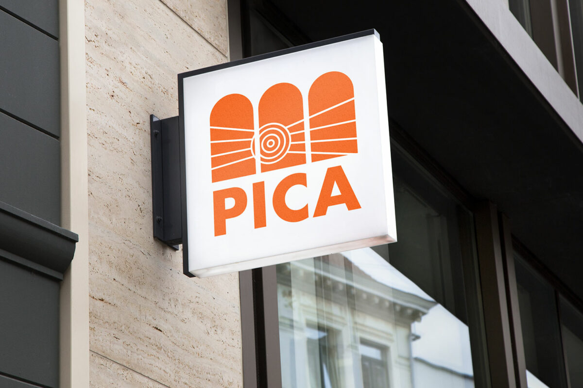
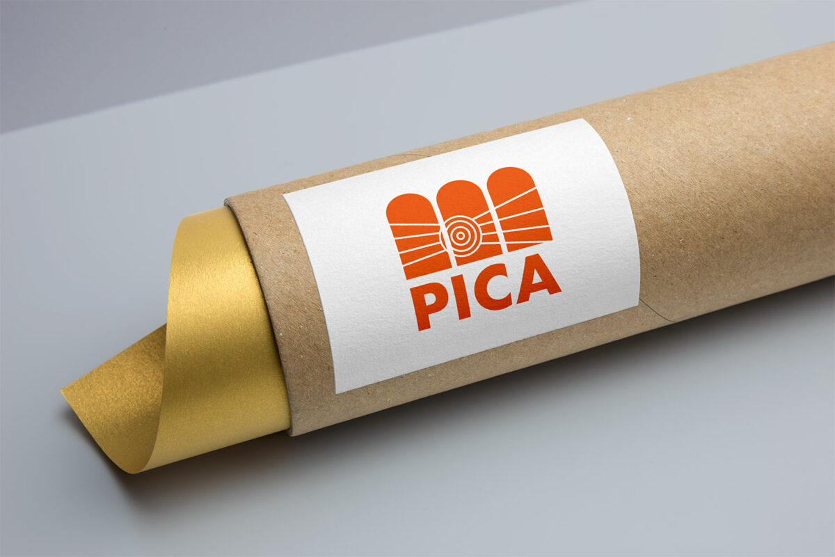
PICA
Scope:
Brand refresh for an Australian cultural institute.
PICA - Perth Institute of Contemporary Arts .
Reflection:
PICA has been housed in its location for 30 years but has been standing since 1896. I wanted to acknowledge the building and the contribution to the overall consumer experience that it brings. I incorporated the triple arches to generate a familiarity and association to the logo and that of the building, making it memorable to the community. I have attempted to convey more than one message through using this architectural element by framing the arches as more than a point of entry into PICA, but also an enticing welcome to visitors and passers-by, inviting them to explore what lay beyond the arches.
This resonates with one of PICA's aspirations: to give the community a glimpse of what’s possible. After all, PICA is grounded in community and remains free to all. In addition to this, I splayed an Indigenous symbol representing ‘meeting place’ across the arches. This demonstrates inclusiveness and acceptance in diversity of cultures with open arms (or arches) towards the community. Being the focal point of the Perth cultural centre, I wanted to tell a story to the community on arrival by making a connection through the 'meeting place' and PICA's stomping grounds.