With proven years of experience as an Industrial Designer, I have had significant contributions to interior design projects within the hospitality, retail and fashion industry sectors. I am really passionate about materials and textures and how those affect the mood of the people in the space. Listening to clients and their expectations fuels my inspiration.
This mixture of knowledge about design allows me to engage in the whole design process from concept development to finished build.
I love research and investigation of the various possibilities of design because I believe in continuing education as the foundation of a possible future. This is why I would like to be involved in projects for educational sectors, museums, libraries, public spaces etc.
Little Venice
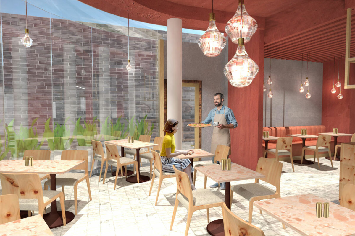
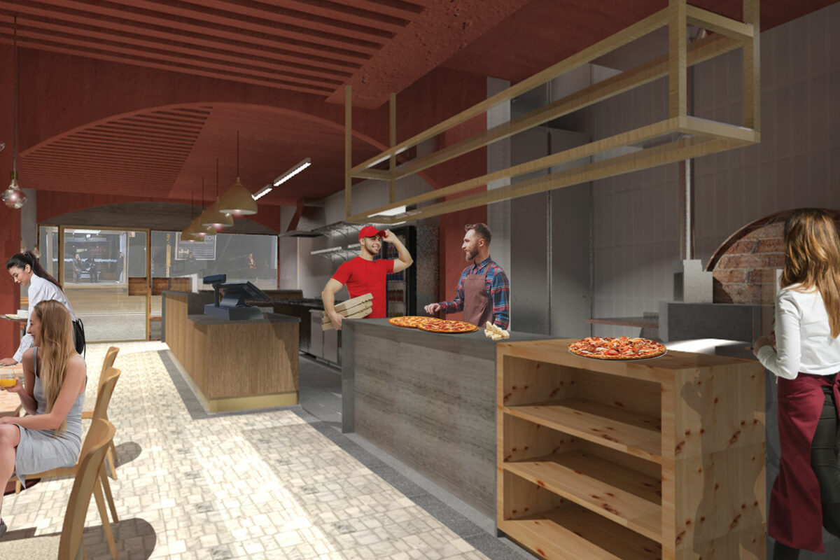
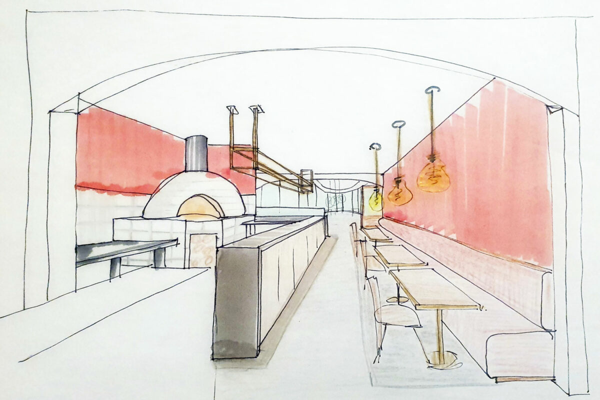
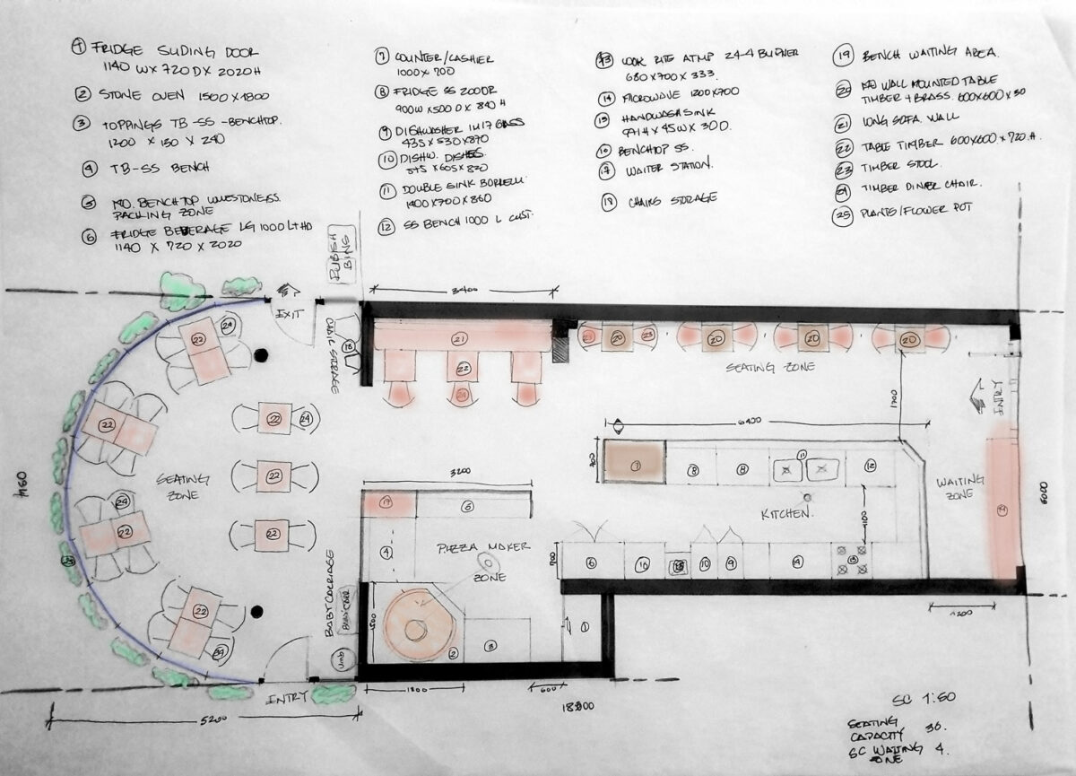
Little Venice is an Australian Italian cuisine located in the heart of Drummoyne in Sydney since 2005. The restaurant has great reception in the neighbourhood, pizza takeaway is the main service and the competitors are a few blocks away. The building is a commercial area in a convergent point in the suburb, a mixture between the modernity and traditional architecture in the city. A great opportunity to bring to the clients a refurbished environment for dinner.
The client is looking to modify the space to utilise the tables on both sides of the restaurant for dining. The Little Venice is the current name, but they consider that the reference to an Italian place is convenient for the new space. Also, they want to increase in-house dining without forgetting the takeaway service.
Client expectation
- Revitalise the environment and make it cosy and bright.
- Involve traditional elements of Venetian architecture.
Blues Point Tower
Blues Point Tower, with approximately 80 levels, is located right on Sydney Harbour and is a mega residential tower, designed to accommodate high-end clientele.
Brief:
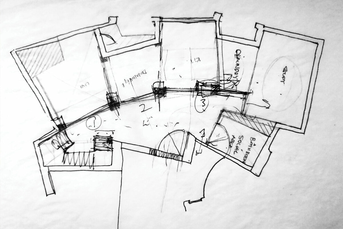
- Create a functional space with separate private and social areas.
- Design the two-level apartments 63 and 64
- The round configuration shift every level 15 degrees over level
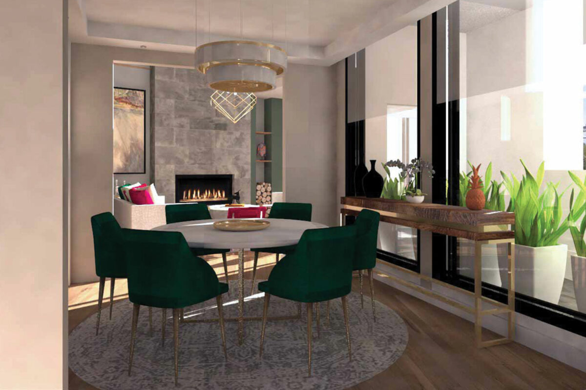
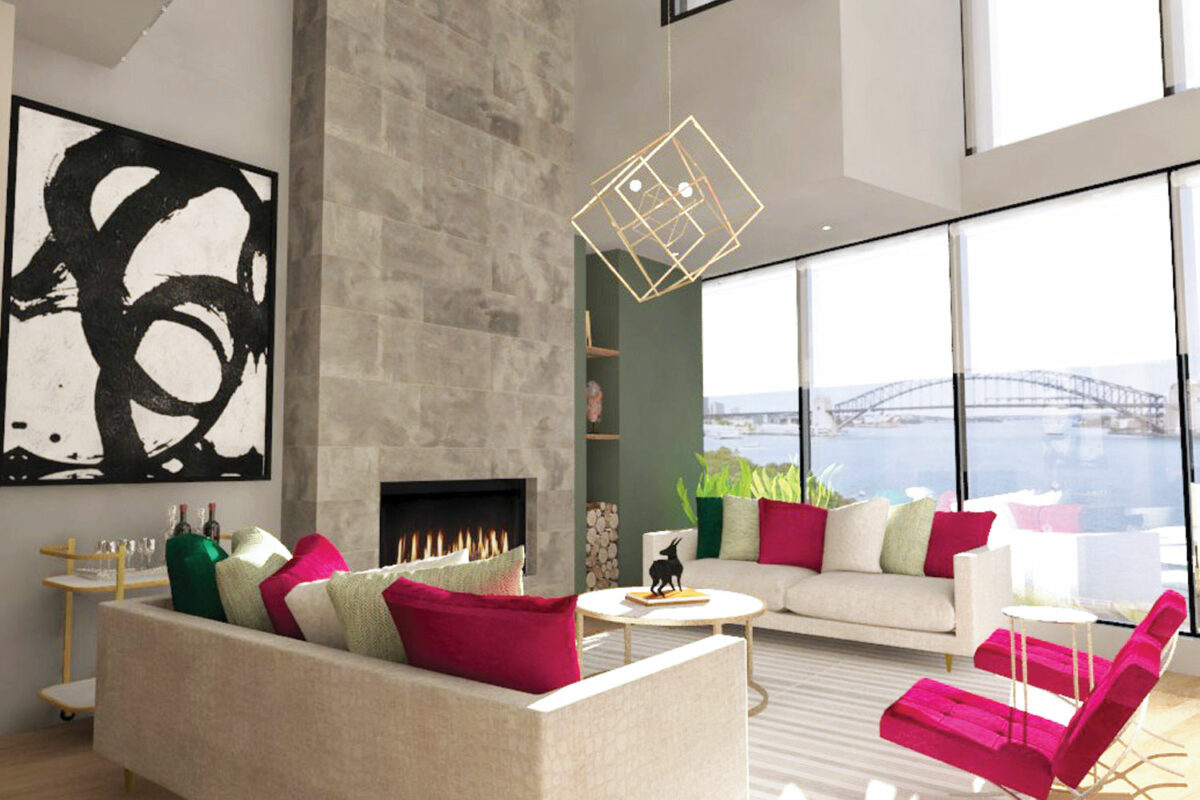
Upon entering, the visitor is drawn into the interior by the expansive view beyond the open plan areas cleverly delineated by the strategically placed walls. These walls are at obtuse angles to match the non-parallel nature of the apartment footprint. The first level frames the view of the Harbour Bridge and the high ceilings provide a void for the living room with the predominance of the ash grey block for the chimney, whilst an olive green and cherry red colour palette gives a vibrant atmosphere to the social area. High rectangular archways connect to the dining area where a round marble table with electric green chairs sits comfortably on the plush, circular rug. Upstairs two master bedrooms with ensuite bathrooms and walk-in wardrobes are located on opposite sides of the unit, providing privacy for each one.
