I am a graphic design student who has lived and studied in China, Japan, America and Australia.
Before studying graphic design, I have worked in the marketing industry for five years. My passion for graphic design, illustration and marketing branding led me to pursue my future career as a Graphic Designer.
I am also a versatile and curious person who enjoys painting, photography, piano and dance.
Bush to Bowl
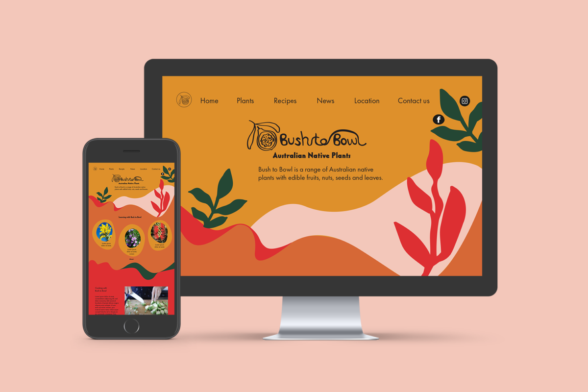
Bush to Bowl is an Australian native plants company that provides not only a program of native plants learning and gardening but also Aboriginal culture communication. It is an open space that welcomes everyone.
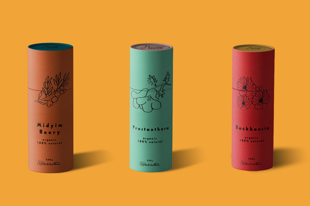
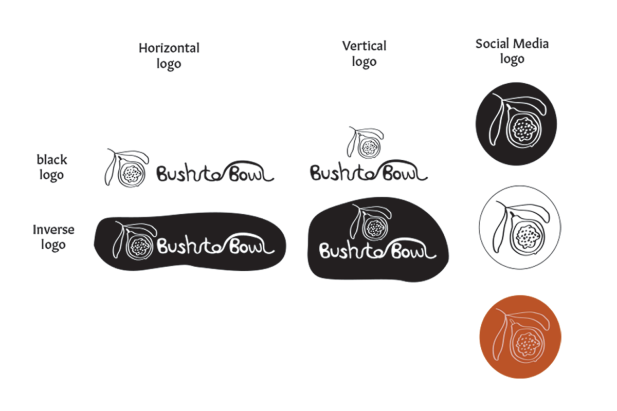
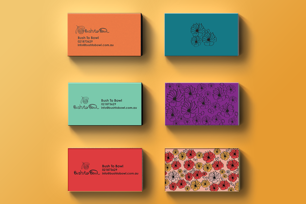
After I took a live brief with the client, I designed the marketing collateral for it. For the logo design, I used fluid lines to connect “Bush” and “Bowl”, as it expresses bush plants are edible food in a bowl. The letters entwine with each other, which also provides a natural plant feeling and the idea of growth. It shows a friendly expression. I also included a fruit element to the logo, which is quandong. Quandong is a unique and typical native fruit in Australia. It also became the individual logo for social media. For other marketing collateral, I maintained the design style as playful and hand-drawn.
The tone of voice for this design is approachable, inclusive, original and colourful.
Kombucha
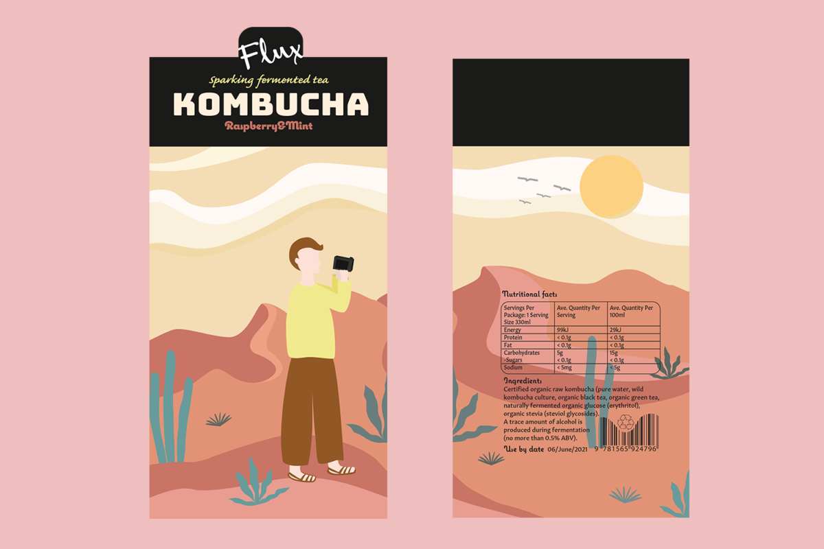
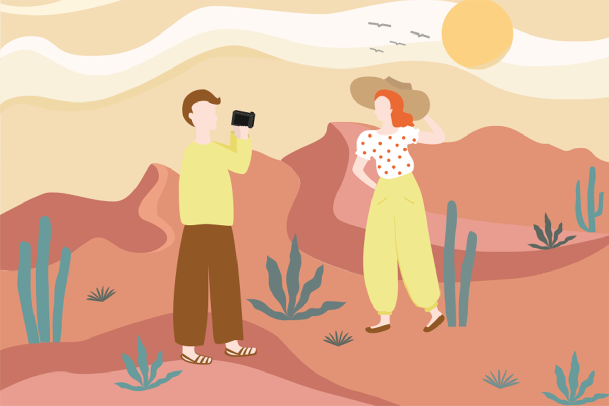
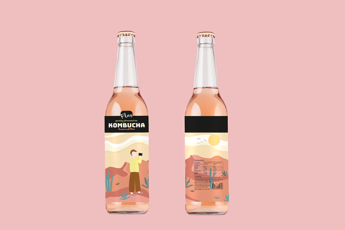
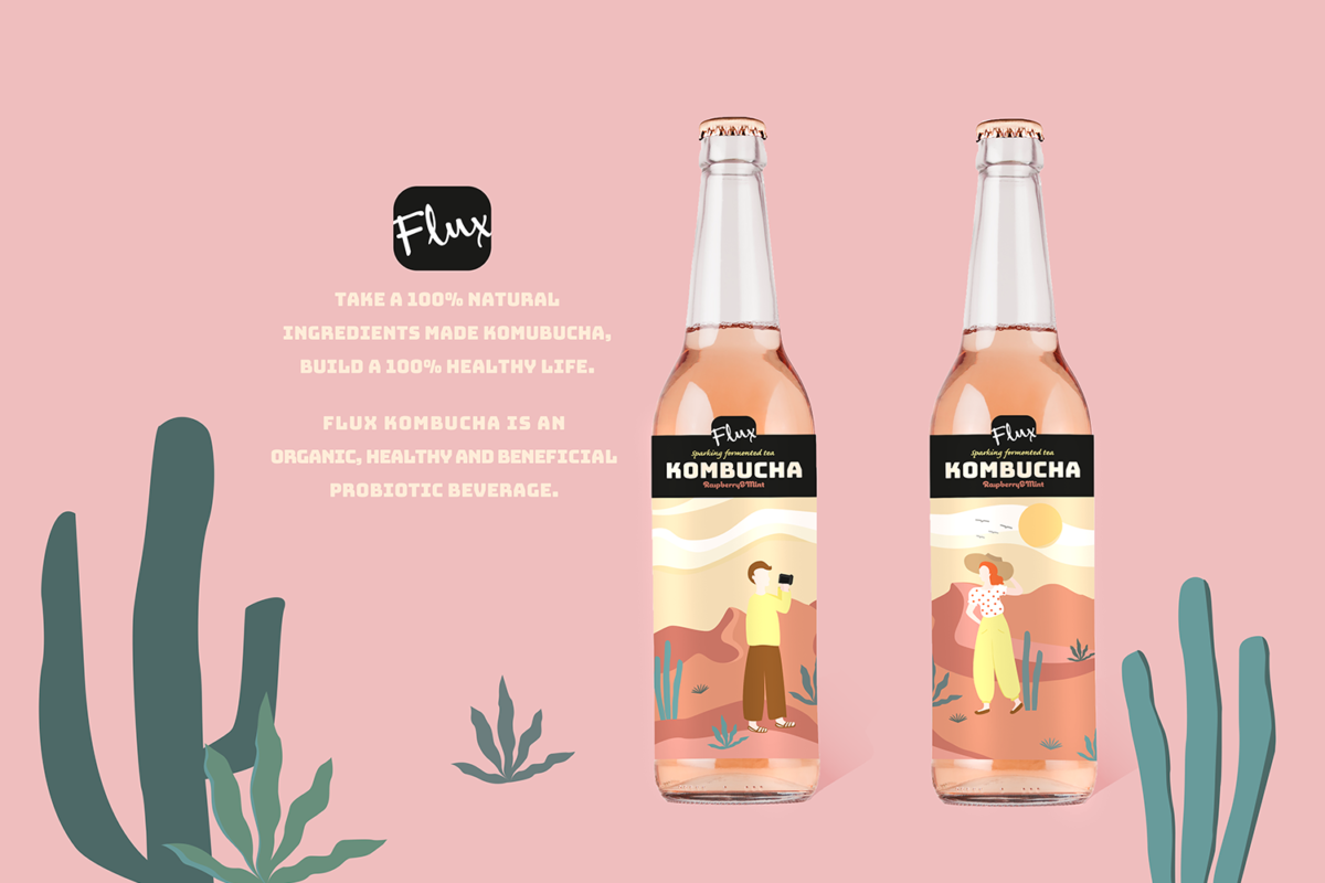
Flux is a sparkling Kombucha beverage brand. The client requires me to design a Raspberry and Mint flavour label for the bottle. I created it as a combination illustration style. The illustration is cut as half and half. I think this design could evoke the customer’s curiosity to get another half of the picture. The primary colour is pink and orange; the secondary colour is green, those colours imply raspberry and mint.
