A creative who is: Driven by life's curiosities. Interested in branding and illustration. Destined to eat blueberries for life.
St. Jerome’s Laneway Festival
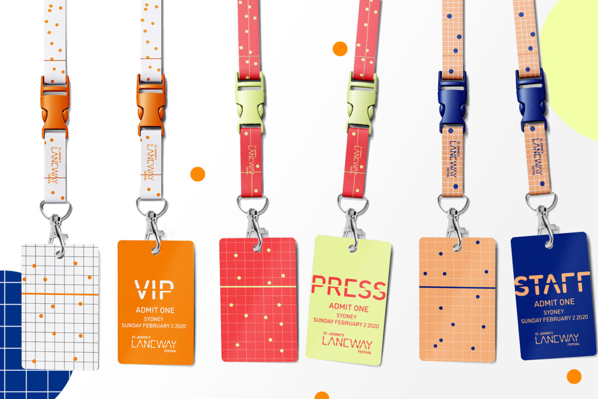
For summer, we want good music vibes. Enter a million different Australian music festivals. It’s a saturated market and a good looking brand system never hurt any festival.
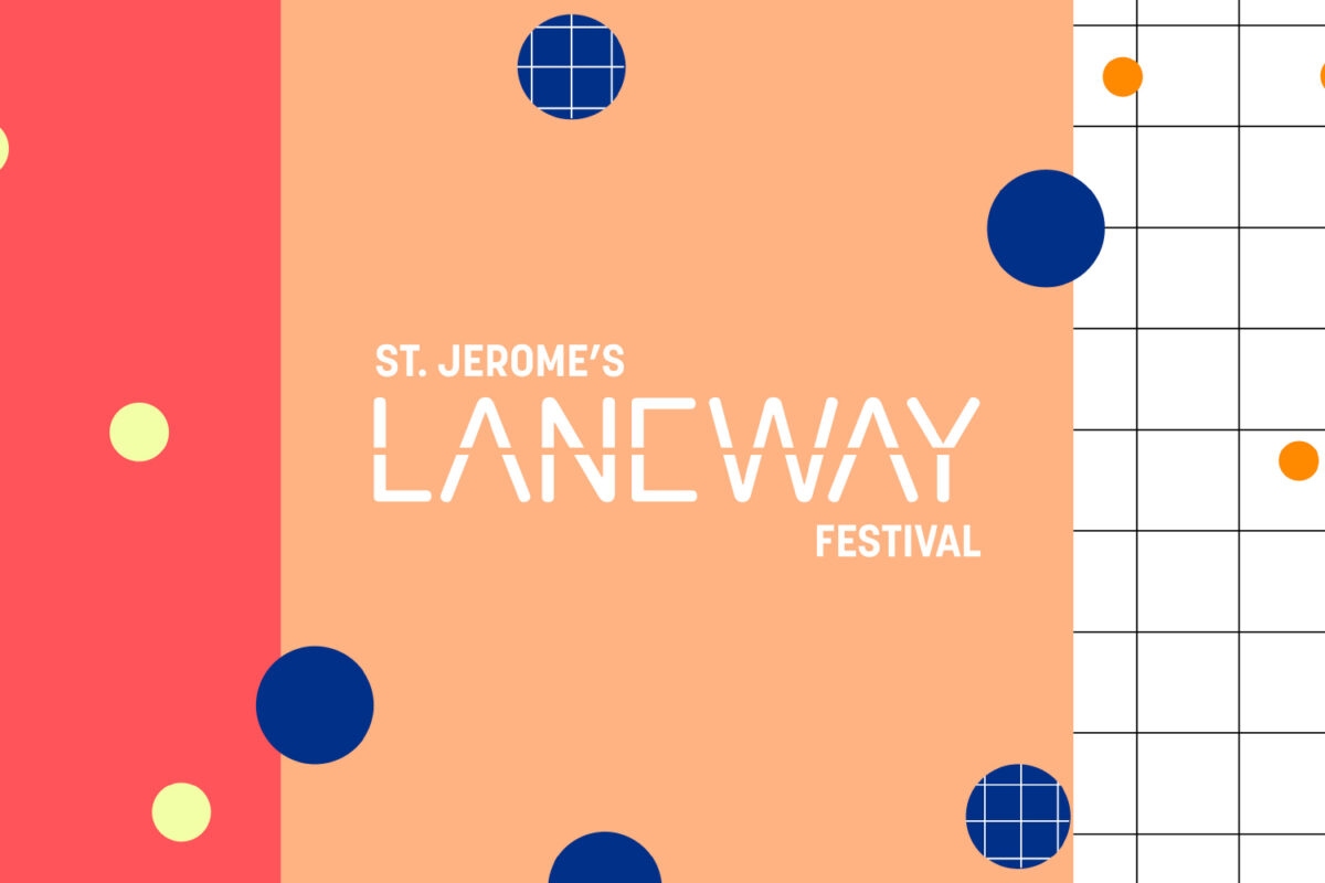
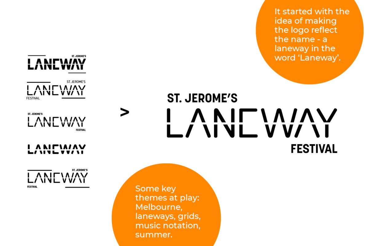
St. Jerome’s Laneway Festival is a big deal now, but it started out in a tiny Melbourne laneway. The logo is a small nod to this.
The branding system needed to represent summer, freshness, music and a hint of Melbourne. What might that look like?
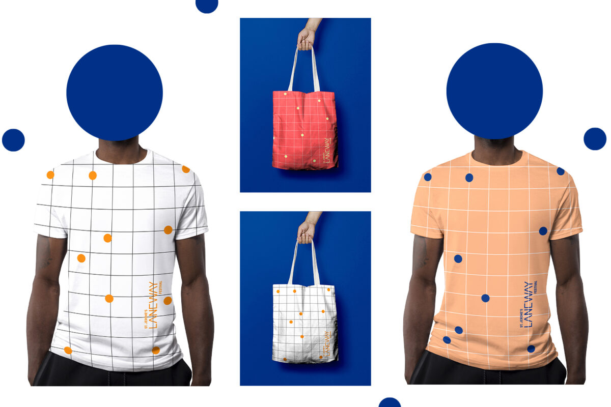
Maybe a warm colour palette, teamed with a play on spots and stripes for an abstract interpretation of music notes and Melbourne's grid.
The Museum of Human Disease
An apt project given the current times.
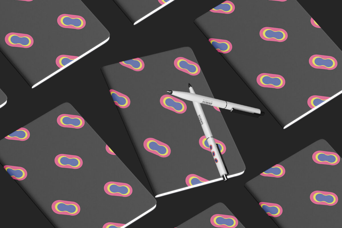
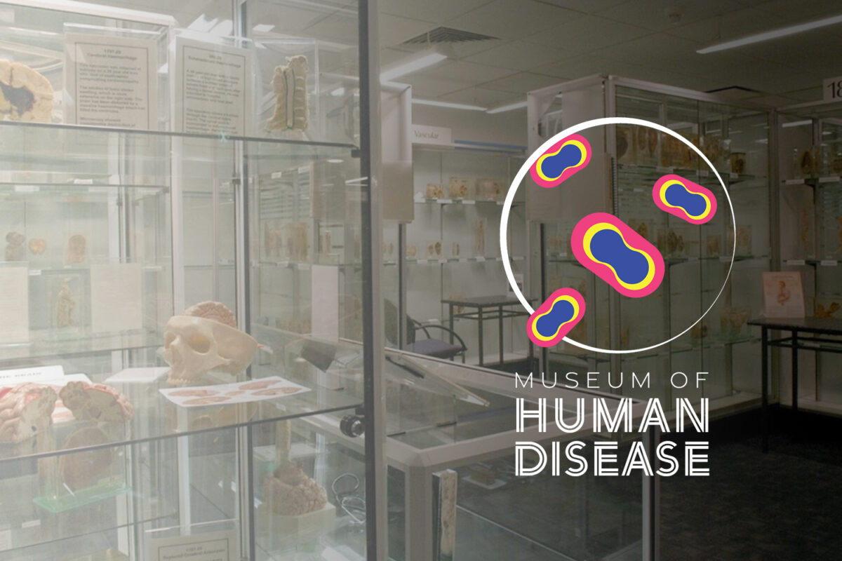
The Museum of Human Disease is a small Sydney museum housing over 2,500 specimens of disease. For something so special, it was a shame it didn’t have its own logo.
This project was all about changing perception. Disease really has a bad rep, (maybe rightly so) but most people aren’t thinking about the highly complex beautiful structures underneath it all.
Geometric shapes and splashes of colour are the driving force behind this distinct logo, using the forms of pathogens in a petri dish.
It's through knowledge that we get to better know ourselves. The knowledge housed here might just save your life.
