While completing my Bachelor degree at Billy Blue College of Design at Torrens University Australia, I utilised my time to immerse myself in live briefs and opportunities that focused on real life projects, to gain experience and help direct myself to the best pathway to grow and develop as a Designer.
After three years of learning and gaining design experience in practical design work, problem-based learning, branding/marketing and 3D software, I am now understanding and applying these skills, as well as the standards of the National Construction Codes (NCC) of Australia to my concepts and designs that are currently under construction.
While I have finished my degree in Commercial Interior Design, I ensured that my final elective subject was Project Management. This break away from design helped me develop my time, organisation and communication skills, while learning the best methods to apply these techniques when managing projects and people.
Some of my achievements include:
My holistic re-design of a retirement village, which was formally presented to Stockland & PDT Architects and during my internship with OC Interiors, completing a full set of DA plans for Brisbane City Council that were approved to change the purpose of an office building in Milton.
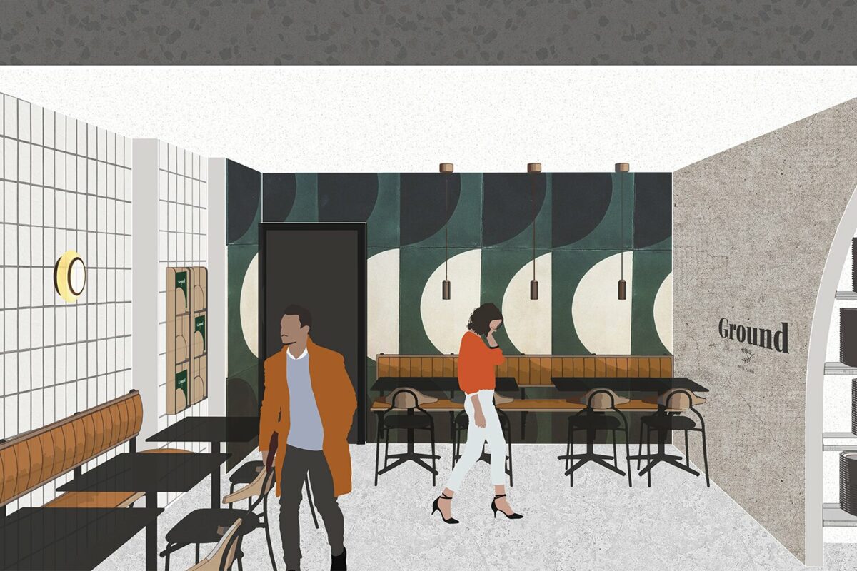
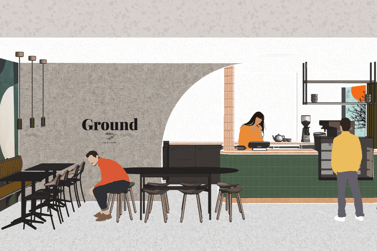
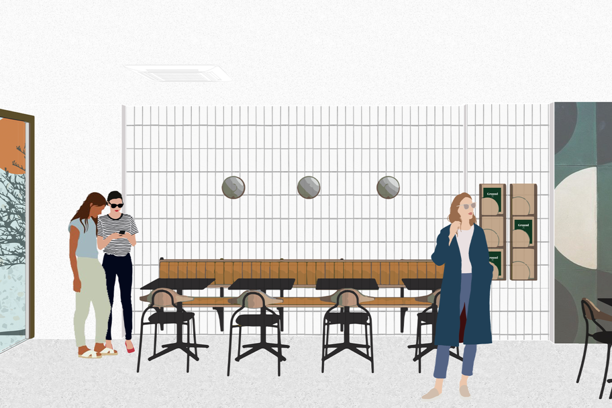
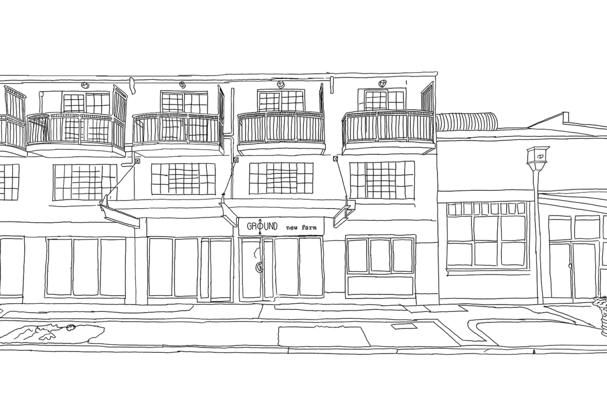
Rebranding & Fit out of an existing café – Ground, New Farm
Software used: Revit, Illustrator, InDesign, Photoshop
Client brief:
The owner of the café and an Interior Designer herself. Her philosophy is to live and breathe local and prioritise giving back to the community. (This was a fundamental element to be considered when beginning the rebranding and design).
The design brief wasn’t specific, as the client had already invested her own time into the current design. With this in mind I interviewed the staff to find out their needs and wants. While I was mindful that Ground rent their current tenancy, the client wanted me to see what design I could create if a budget wasn’t considered.
Ground, New Farm wants to share their love of community and coffee with you through every cup of goodness. From sourcing the highest quality ingredients and always striving to provide the perfect brew. Their new image combines the nostalgia of their existing branding with the excitement of a modern menu and space, to give their valued customers #groundsquad, an exceptional coffee experience - every time. It’s this passion and dedication that drives their coffee journey from the ground up.
Youth Homelessness Pavilion
Software used: 3ds Max, InDesign, Photoshop, AutoCad
Persona Brief:
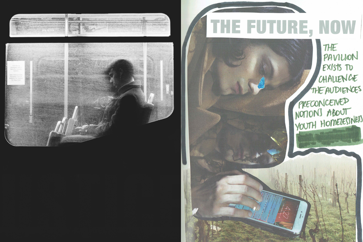
Youth Homelessness impacts 100,000 Australians on any given night. More than one third (36,000) are teenagers and young adults. This statistic inspired me to investigate a persona that is impacted by this issue.
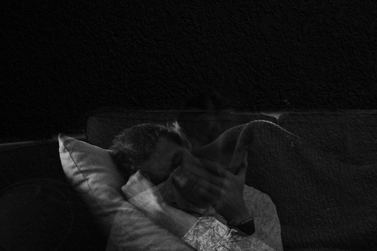
Chris (20) has been displaced from his home for over 3 years and was living with his mother until the death of his father. The decline in his mother’s mental health and dependency on new partners, meant that she was unable to care for him. Strong emotional turmoil can develop, such as the image of being ashamed (double exposure), as Chris couch surfs at friends’ houses.
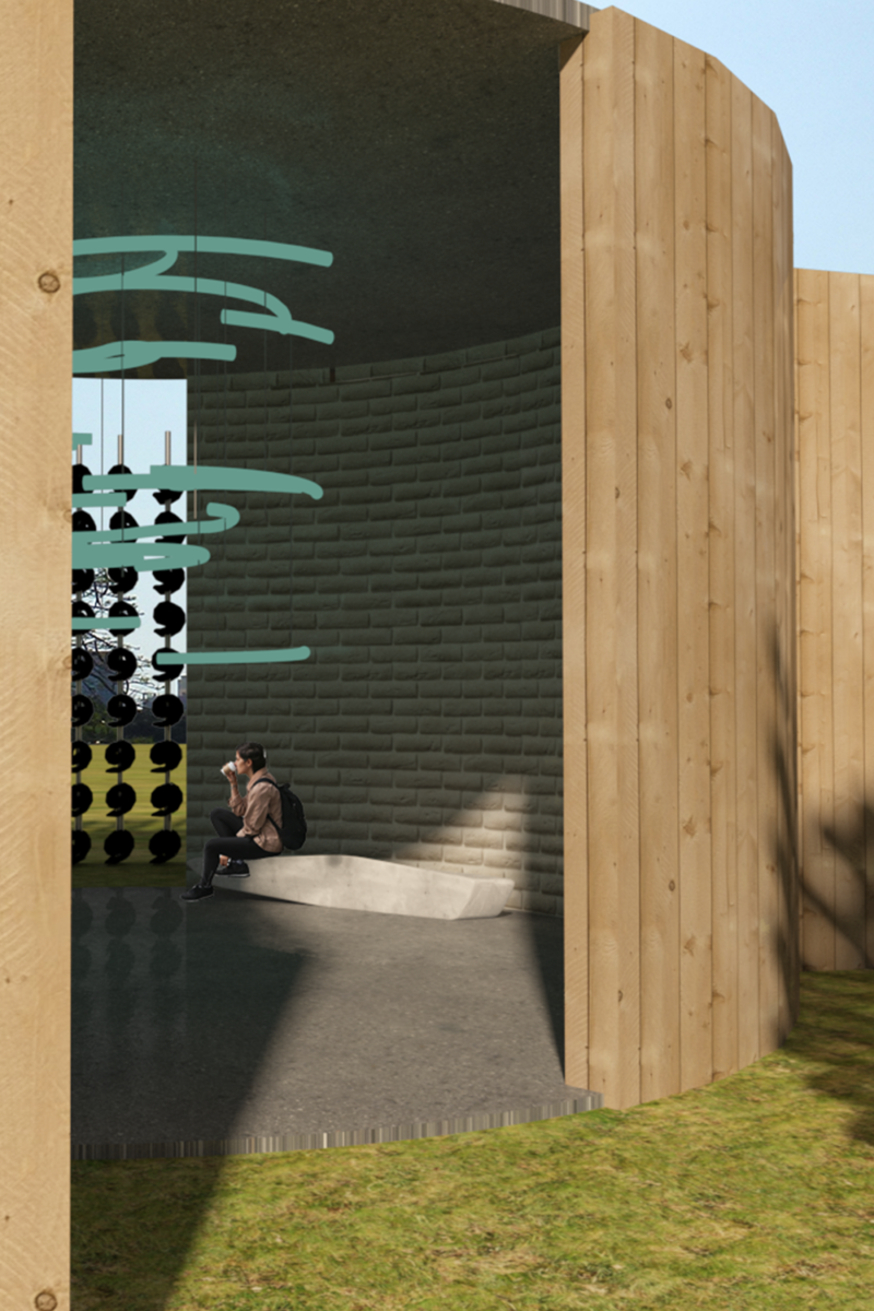
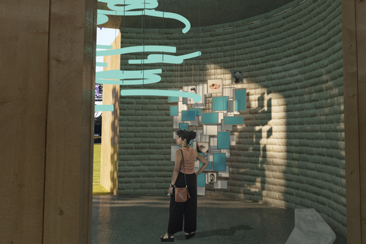
On the other hand, the intended design of the pavilion is to raise awareness of this prominent issue and the circular cycle of homelessness. The audience experiences a journey as they travel through the space and are in awe of the light exterior and forced to reflect in the dark interior. The dark interior features an LED light and a collection of hanging photographs of local homeless youth and their story – providing a face for the issue and reflecting the multitude of ways youth can become homeless.
