Hello! My name is Frankie and I believe my background in art and my previous degree in Sociology have given me the ability to approach my work from a multi-disciplinary perspective. I am interested in brand identity and editorial design and growing my skills in motion graphics. Ready to get industry experience from the beginning, I've had the opportunity to do internships at both MTV and Urban List as well as building up freelance work while completing my studies. I'm now working as a Graphic Designer for General Pants Co. and look forward to future collaborations and continuously learning and growing as a designer.
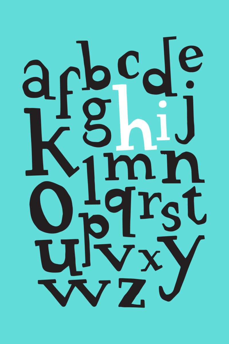
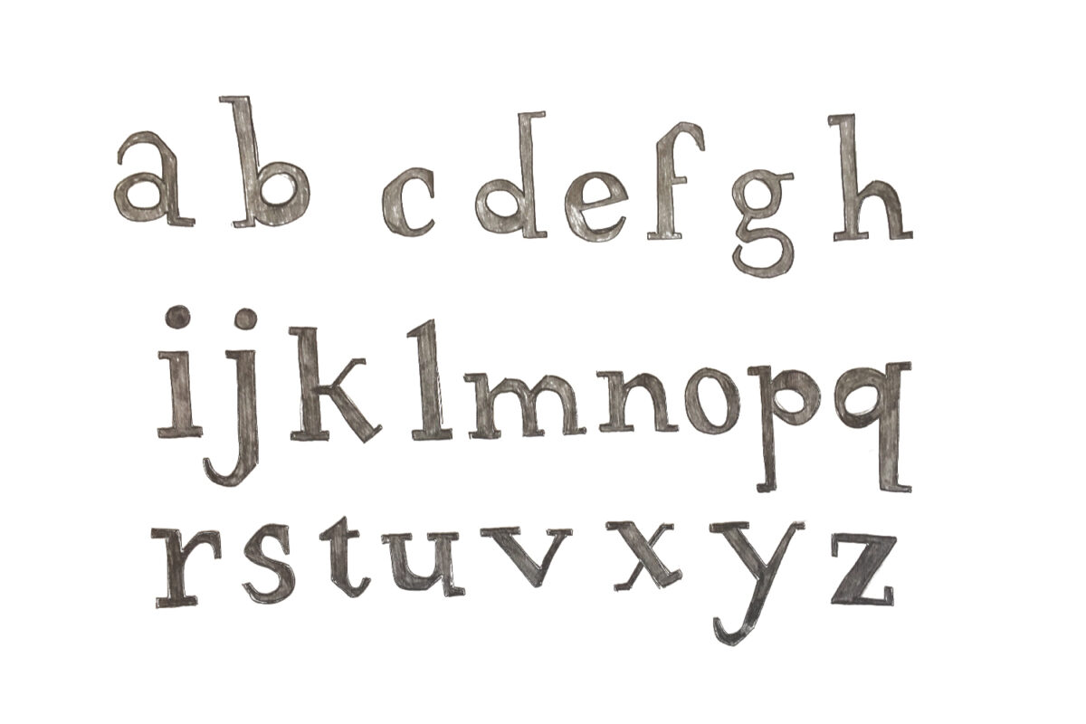
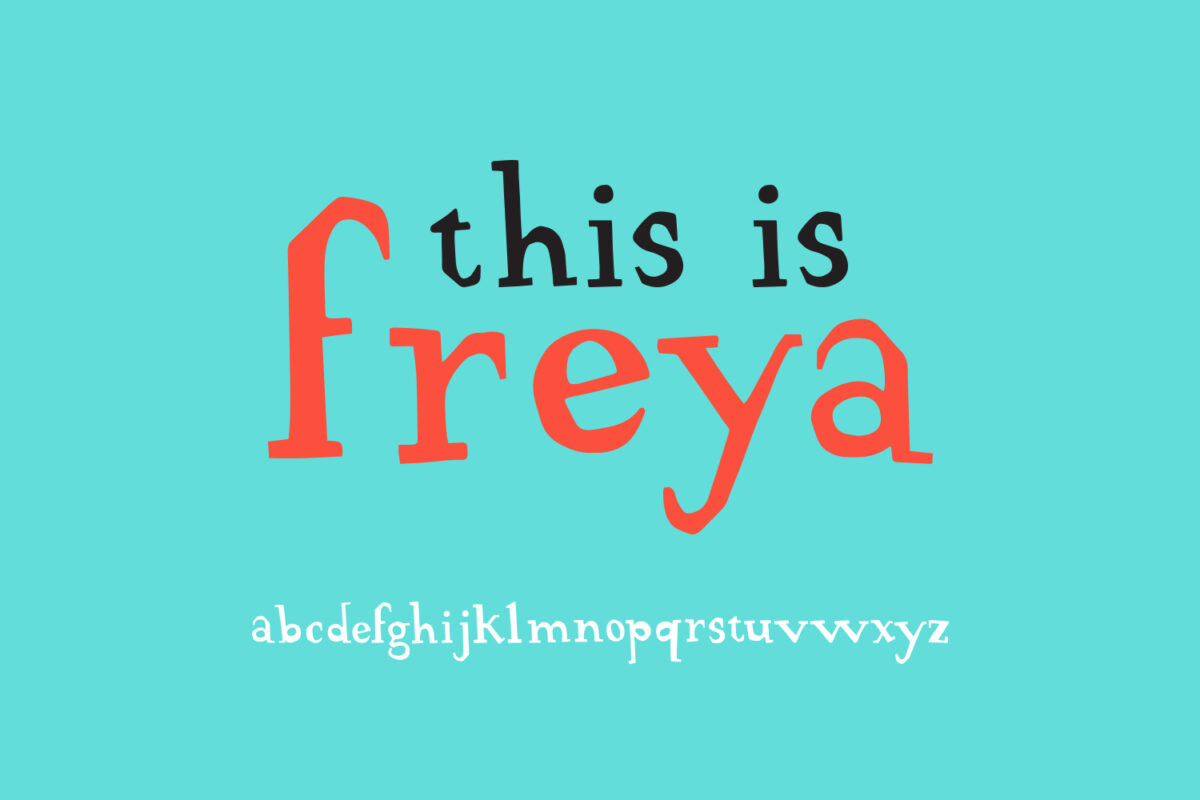
Original Typeface Development – Freya
This subject was essential in developing my attention to detail, ‘typography eye’ and understanding the anatomy and language of type and how to apply this effectively into my work. We began by identifying and analysing the typeface on 10 objects of our choice (I chose to analyse the typefaces used on the covers of 10 self-help books). We then began research into the development of our own original typeface studying a typeface of our choice, understanding how its features affect its personality, creating mood boards and type personas. My display typeface named Freya is categorized by slab serifs, wedge terminals, varied strokes creating a high contrast and oval counters stressed at an oblique axis. These features give it a stylish, quirky and confident personality. I imagine it being used in fashion campaigns or as headlines in design publications.
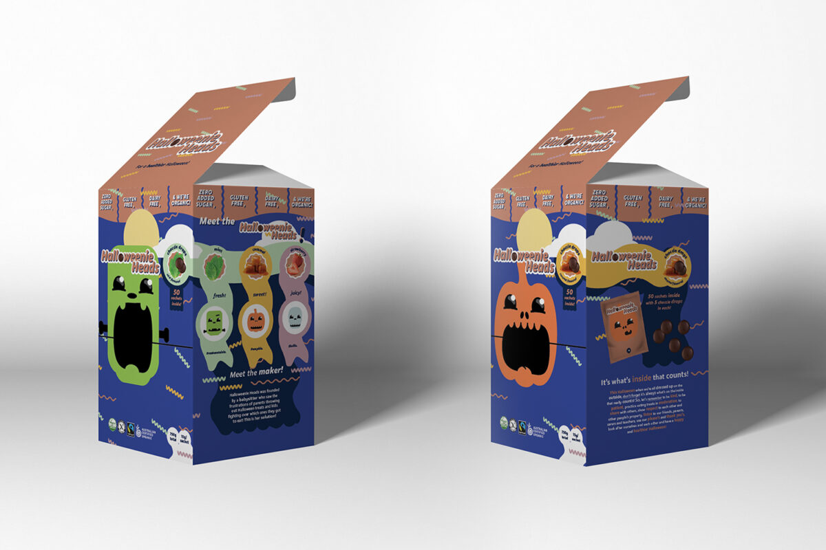
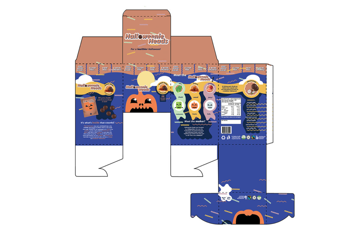
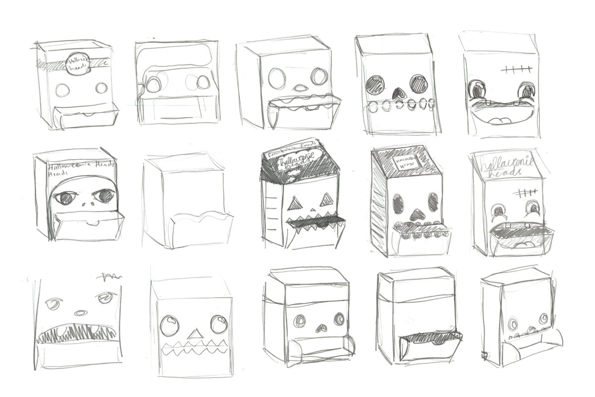
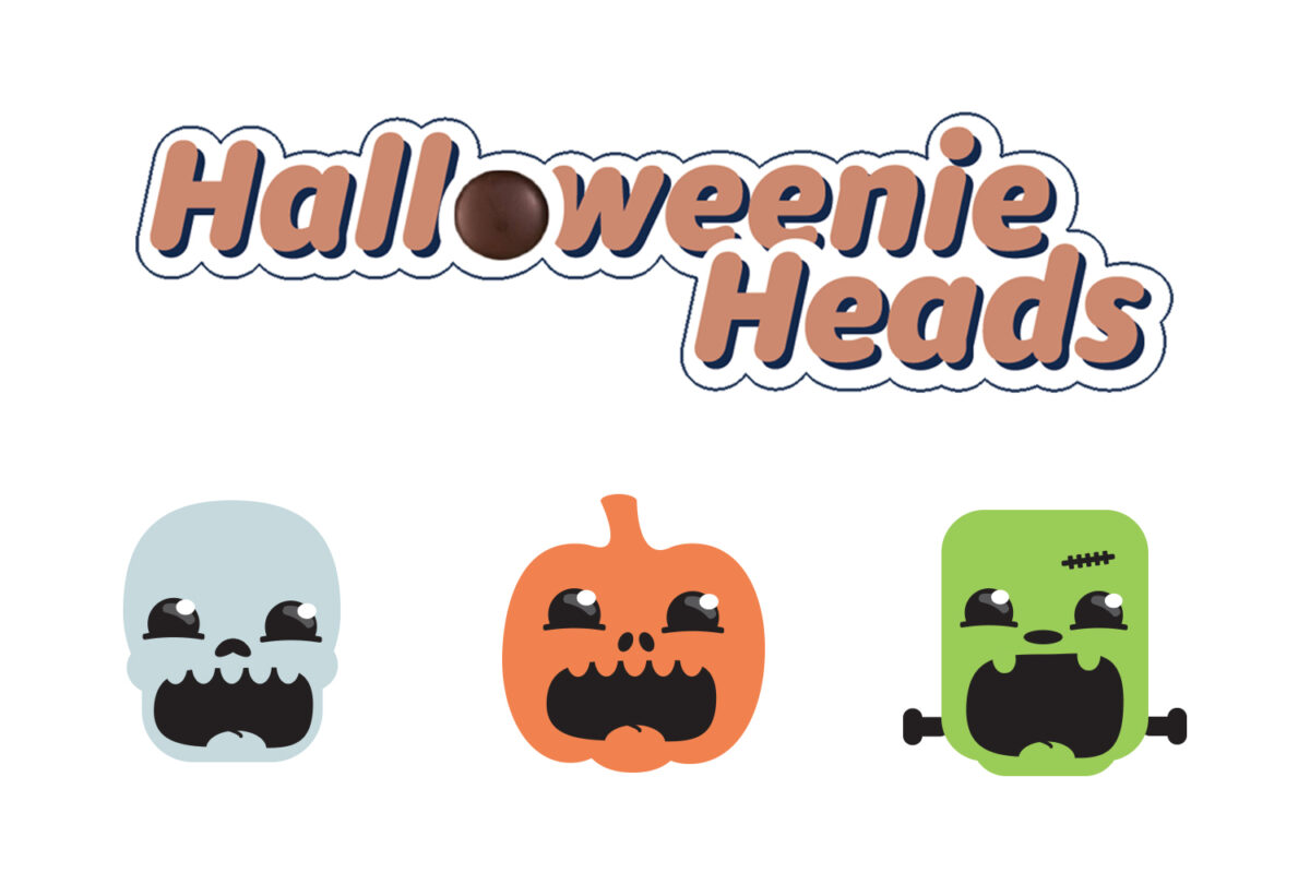
Packaging Design – Halloweenie Heads
This food packaging design project involved research into the consumer, competition, shelf appeal, 3 x design propositions, initial concepts, prototypes and development, branding, creating a dieline and finished art as well as a printed rationale demonstrating this process from concept to execution. I enjoyed approaching this brief from my personal experiences as a babysitter, seeing the frustrations parents feel during Halloween around the lack of healthier, more conscious options and kids fighting over who gets to eat what and who collected more. I wanted to create a product and brand that championed the idea of “it’s what’s on the inside that counts” alluding to both healthier ingredients and also values of kindness and sharing. This subject gave me a new found appreciation for packaging design and it’s definitely an area of design I’d love to work in. Also shopping hasn’t been the same since.