Hi, my name is Elli (short for Elizabeth). Along with my recent qualification, I exhibit a long history in creative industries, where I was a Fashion Designer for the past 34 years. I have moved away from textile design and found a passion for interior design & open, inviting and usable living spaces.
Barrack Street Glass House - Public Space
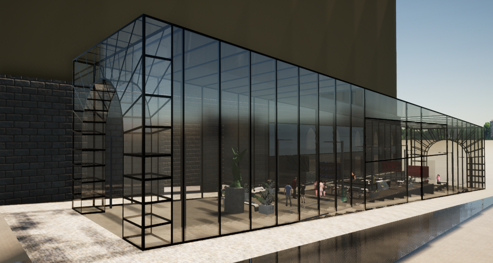
Barrack Street is one of Sydney’s charming little side streets that is located between George & York Streets, with easy access to amenities including bus and rail transport links. Its central CBD location offers convenient access to public transport which literally covers the north, south, east, and west of Sydney.
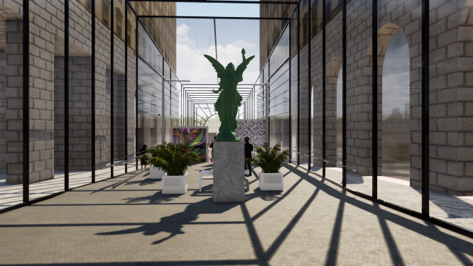
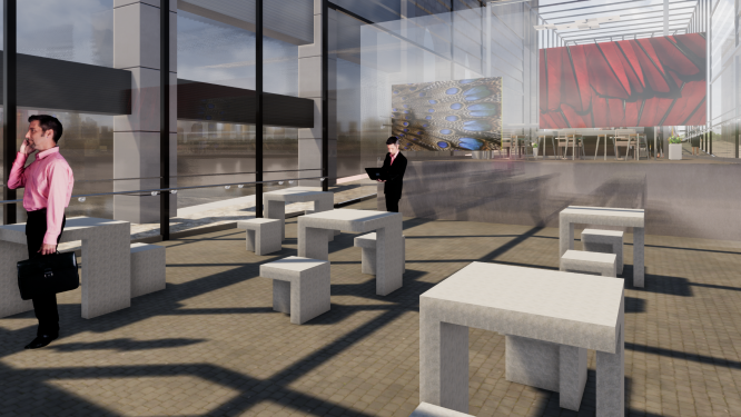
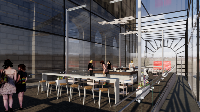
The request was to design a special space bubble that will attract the public with genuine activity. Heavy-duty framed glass was chosen and used throughout the "space bubble" complex to create an impression of a bright, spacious environment that maintains the appearance of being outside whilst comfortably seated within the cool insulated glass bubble.
The use of glass facade surfaces only was expected.
The digital gallery exhibits stills and motion art over eight large screens, providing a visual feast of modern, contemporary and Indigenous art presentations and may also include fundraising campaigns that will create a social interest & awareness within the complex.
The Barrack St Glass House Gallery currently exhibits "FEATHER WINGED", an awareness-raising campaign for saving many winged species of our planet that are hovering on the brink of extinction from illegal trade in wild birds and the cruelty of the feather down plucking industry.
The campaign highlights many environmental, economic development, and long term bio-collapse risks.
Crystalpea Jewellery - Retail Store
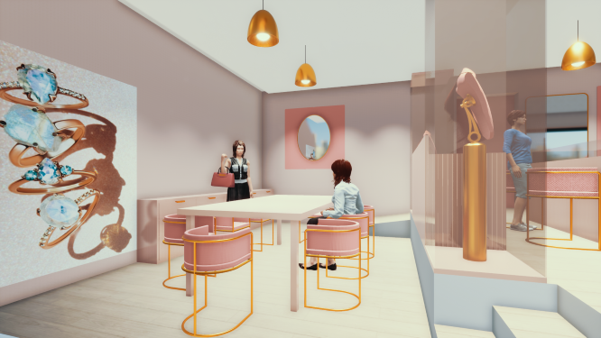
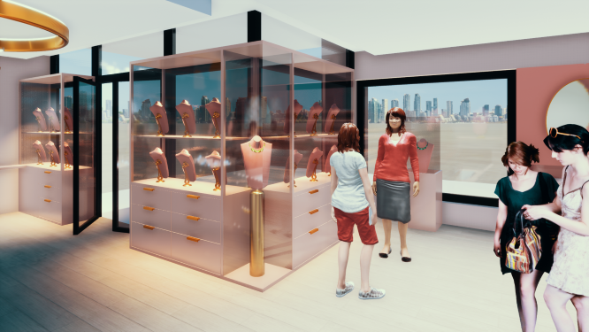
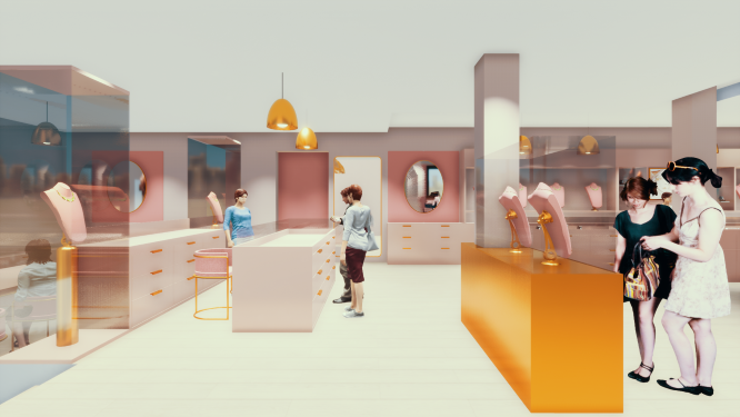
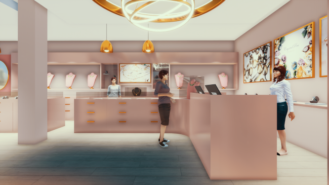
CrystalPea Jewellery store was reconverted from a large hair salon to a retail shop following a specific client’s brief. The requirements focused on emphasising the sale point counter, large display storage & set a workshop studio to allow up to 10 learners for jewellery making classes. The project demanded a demolition plan, as well as existing material & disposal analysis. Client and designer, Maria Dachman requested the use of colour, finishes, and light management to highlight and promote her pieces of jewellery.
Display counters along walls were used to create space opening and view from each direction.
The workshop studio area was extended by one metre with an extra display counter desk separating from the retail area.
Illumination was carefully selected to continue the outside natural light.
The acoustic plaster-hung ceiling contains 16 dimmed LED downlights and gold strip pendant lighting installed above the shop's display, which continues the femininity with a pink trend of blush-tone surfaces.
The accent lighting placed in the entry adjacent to the sales desk, accent wall and area in front creates visual drama and a glamorous welcoming effect.
